In this post, we’ll take a look at what makes a great SaaS website, our favorite SaaS website examples and how you can use web design to convert visitors into users.
As innovators in SaaS website design, we know that great websites don’t happen by accident. In fact, the best sites are designed with great intention. Having an expertly and purposefully designed SaaS website is crucial to business success.
A great SaaS website design offers visitors an educational and user-friendly experience that leads them to information that will move them forward in the buying process, whether that’s convincing them to request a demo, start a free trial or make a purchase.
What Makes a Great SaaS Website?
A good SaaS (Software as a Service) website is essential for attracting and converting potential customers. Here are some key features that contribute to making a successful SaaS website:
Clear Value Proposition
In a competitive SaaS market, there are often multiple solutions addressing similar problems. A strong value proposition clearly communicates what sets your SaaS product apart from the rest. It helps differentiate your offering and highlights the unique benefits that customers can gain by choosing your product.
A clear value proposition immediately communicates the primary value and benefits of your SaaS product to potential customers. It helps them understand how your product can address their specific needs or pain points.
Your value proposition sets the tone for your marketing messaging across various channels. It helps create consistency in your marketing efforts, ensures that your SaaS company presents its core message effectively, and resonates with your target audience.
User-Centric Content
User-centric content is essential for your own SaaS website because it focuses on meeting the needs and interests of your target audience. By creating content that resonates with users and addresses their pain points, your SaaS website can effectively create customer engagement, cultivate social proof, build trust, and ultimately convert them into paying customers.
User-centric content demonstrates that you understand your audience’s challenges and are genuinely interested in helping them. This empathy fosters a positive perception of your brand and builds connection with potential customers. Examples of user-centric content include customer testimonials, a tailored demo video, and a seamless user experience.
Pricing Page and Calculators
A SaaS pricing page showcases transparency in your pricing structure, which builds trust with potential customers. When users can easily find and understand your pricing details, they are more likely to feel confident about doing business with you. Many modern SaaS companies tend to include pricing, which allows for more transparency between competitors.
Including pricing information on the website reduces friction in the buyer’s journey. Visitors can quickly determine if your SaaS solutions fits within their budget and whether it aligns with their needs.
A pricing page also acts as a qualification tool. By displaying the various pricing plans and their features, you can attract the right customers who are willing to pay for the value your SaaS product provides.
Relevant & Obvious Calls to Action (CTAs)
A CTA on your SaaS homepage provides clear direction to website visitors, guiding them towards the next step you want them to take. Without a CTA, users might feel lost or unsure about what action to take, leading to lower engagement and conversion rates.
The primary goal of most SaaS websites is to convert visitors into customers or trial users. A strategically placed and well-designed CTA can significantly improve conversion rates by encouraging users to take the desired action, such as signing up for a free trial, starting a demo, or subscribing to the service.
A well-crafted CTA can also instill a sense of urgency, motivating users to act quickly. Time-limited offers or phrases like “Limited Time Only” can nudge users to take action to avoid missing out on an opportunity.
Lastly, by tracking clicks and conversions on your CTAs, you can gather valuable data on the effectiveness of your website and marketing efforts. This data helps you identify areas for improvement and optimize your website to better meet user needs.
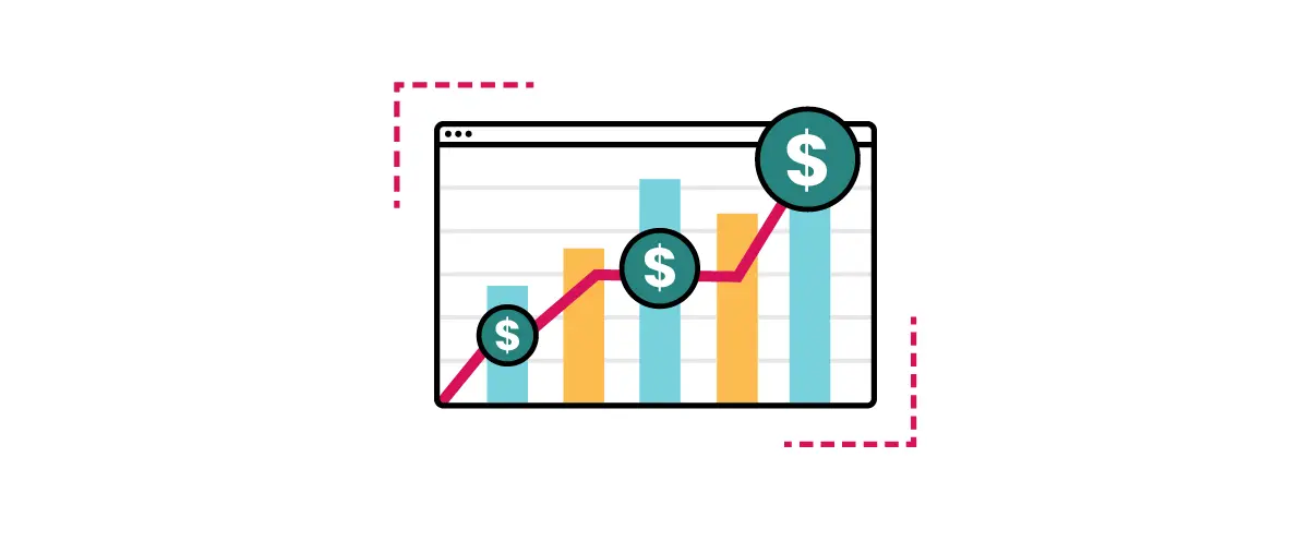
Videos, Images, and Animations of Your Product Features
Images and videos make the website visually engaging and appealing to visitors. A well designed SaaS website utilizes visuals to capture attention, which can lead to higher user engagement and longer time spent on the site.
Videos specifically are an effective way to demonstrate how the SaaS product works in real-time. Seeing the product in action can help users understand your product’s capabilities and how it can address their needs.
In addition, search engines value visual content, and including relevant images and videos can boost your website’s SEO ranking and visibility in search results.
Videos can also be used as educational resources, providing tutorials, product guides, and onboarding materials. This empowers users to learn more about the product and how to use it effectively.
Relevant Case Studies
Case studies provide concrete evidence of your SaaS product’s success and effectiveness. They act as social proof, showing potential customers that your solution has been tried, tested, and proven to deliver positive results for real clients.
Case studies also offer real-world examples of how your SaaS product has been implemented and the specific challenges it has addressed. This helps potential customers understand how your solution could be relevant to their own business needs.
Search Engine Optimization (SEO) Strategy
An effective SEO strategy helps improve your website’s visibility in search engine results. When your website ranks higher in relevant search queries, it attracts more organic traffic, potentially increasing the number of leads and customers.
SEO allows you to optimize your website for specific keywords and phrases that your target audience is searching for. This helps you attract highly relevant and targeted traffic, increasing the likelihood of converting visitors into customers.
In the competitive SaaS industry, having a well-executed SEO strategy can provide a competitive edge. By outranking competitors in search results, you can gain more exposure and capture potential customers before your competitors do.
Support Page or Chat System For Customer Feedback
Offering a dedicated customer support page improves the overall user experience on your website. Users appreciate having a convenient and easily accessible resource for resolving issues related to your SaaS product.
Demonstrating that you have a customer support system in place shows that you value your users and are committed to helping them succeed with your SaaS product. This builds trust and confidence in your brand.
The customer support page is an ideal place to host comprehensive documentation, user guides, and tutorials. These resources enables users to learn more about your SaaS product and maximize its value.
Modern Design Elements
Additionally, great SaaS website designs look modern, capture attention with various design elements and build trust among your prospects. Your website should always match your branding, including your brand colors and fonts, and should be consistent with the look and feel of other marketing materials or digital channels you have established. This helps make your brand memorable.
Of course, general best practices might not always be what’s best for promoting your specific SaaS product or target audience. The website discovery and strategy process should always include careful analysis and consideration of your ideal customer personas.
After all, your customers are the ones who need convincing that your product is better than all other solutions out there to help your business succeed.
12 Great SaaS Website Examples
The best way for us to showcase what makes a successful SaaS website is to share examples that we feel really hit the mark. Below is our current listing of the best SaaS websites.
You will find that these 12 examples not only look visually appealing and offer a great user experience – they also do a great job of incorporating most or all of our SaaS website design best practices.
1. Notion
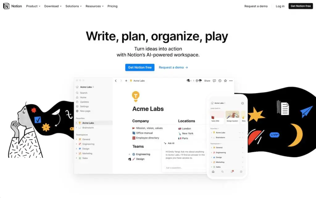
Notion is a shared digital workspace designed to connect people, tools and projects.
We appreciate Notion’s design for its incorporation of the following SaaS website best practices:
- Promotion of user-centric content
- Use of large-font headers
- Incorporation of ample white space (the empty space surrounding graphics, text and other design elements)
- Use of screenshots to display the software and interface in action
- Inclusion of easy-to-find pricing menus with free service options
- Creation of content that supports the buyer through the purchasing process
Ease of navigation is also incredibly important when it comes to SaaS website designs, and Notion knocked it out of the ballpark. Their homepage seamlessly leads you through the platform’s benefits and use cases, culminating in a clear CTA to try it out for free.
2. Figma
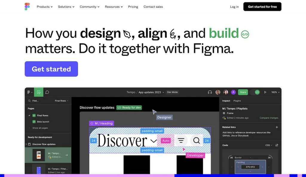
Another one of our favorite SaaS website examples is Figma. Figma is a web app that allows users to easily connect to deliberate ideas, build prototypes and find solutions.
Some of the design elements we appreciate about Figma’s website include its:
- Use of movement in the header to capture attention in a meaningful way
- Combination of graphics and motion to actually show the platform in action
- Powerfully emphasized CTAs, including its stationary “Get Started” button that scrolls along with you down the right side of the page
- Use of graphics in the drop-down menus to quickly showcase differences in product versions
Figma’s menu is also clearly laid out and labeled, making it easy for visitors to find the information they’re looking for.
3. 1Password
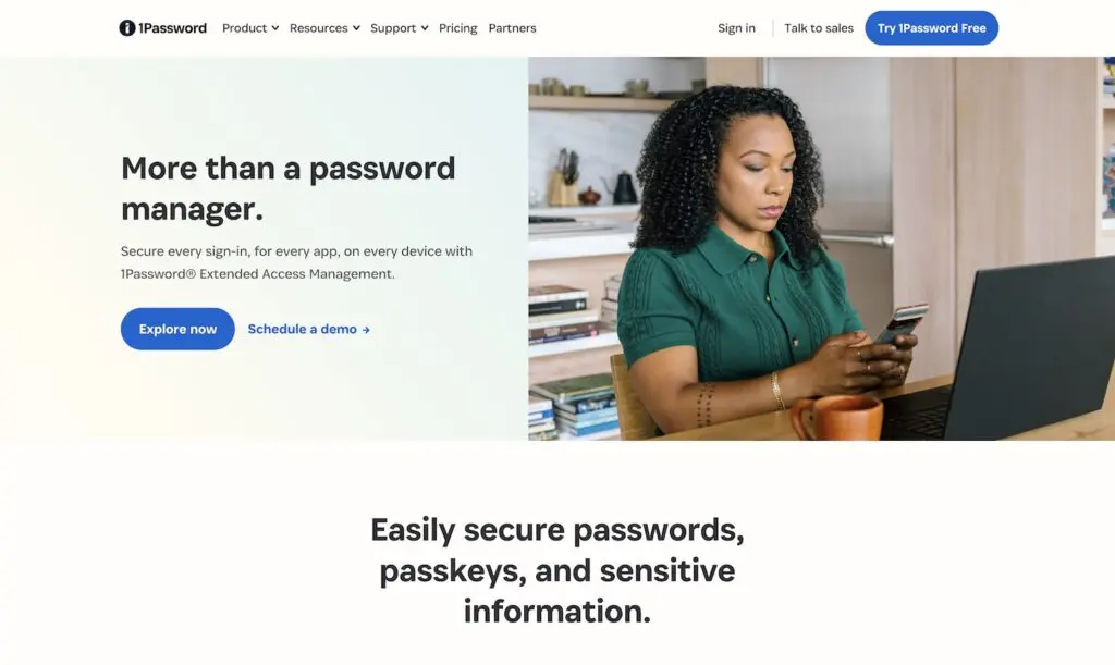
1Password is a password management service that helps you develop and safely store strong passwords.
Aside from an aesthetic and interesting appearance, 1Password’s website provides:
- A concise message on who they are and what they offer
- Multiple CTAs above the fold geared toward different points in the buying journey, including the options to schedule a demo, try the service for free or head straight into a purchase
- A menu that scrolls along with you, always giving you quick access to view product info, resources and support options
- Interactive media to showcase the platform’s benefits
- Repeated messaging about security to build trust, which is central to its service
4. Calendly
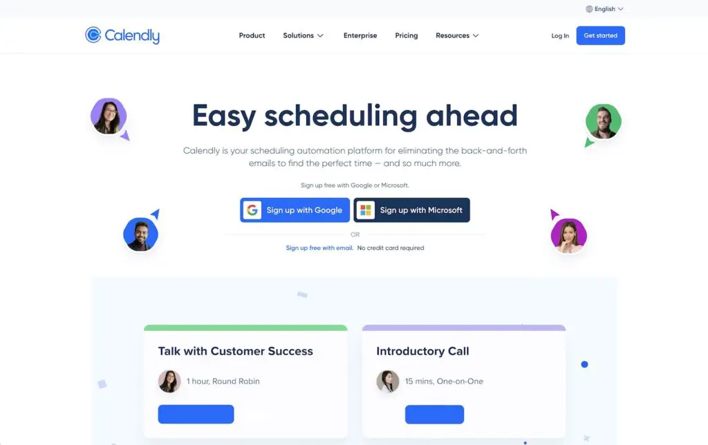
A scheduling platform that we find notable when it comes to great SaaS website examples is Calendly. The platform allows users to easily schedule meetings and share their availability with others.
When it comes to SaaS website design, Calendly offers:
- The ability to sign up using platforms where users may already have an account, such as Google and Microsoft
- User-centric messaging that quickly identifies and solves customer pain points, such as “eliminating back-and-forth emails for finding the perfect time”
- A pricing table that clearly lays out the various prices, plan options and differences between each
- Case studies and statistics to showcase its highest-value benefits
- Distinct CTAs that highlight the platform’s simplicity and ease of use to convert visitors
- A calming blue color scheme to associate the brand with reduced stress when it comes to scheduling meetings (and let’s face it – we could all use that!)
5. SimpleStage
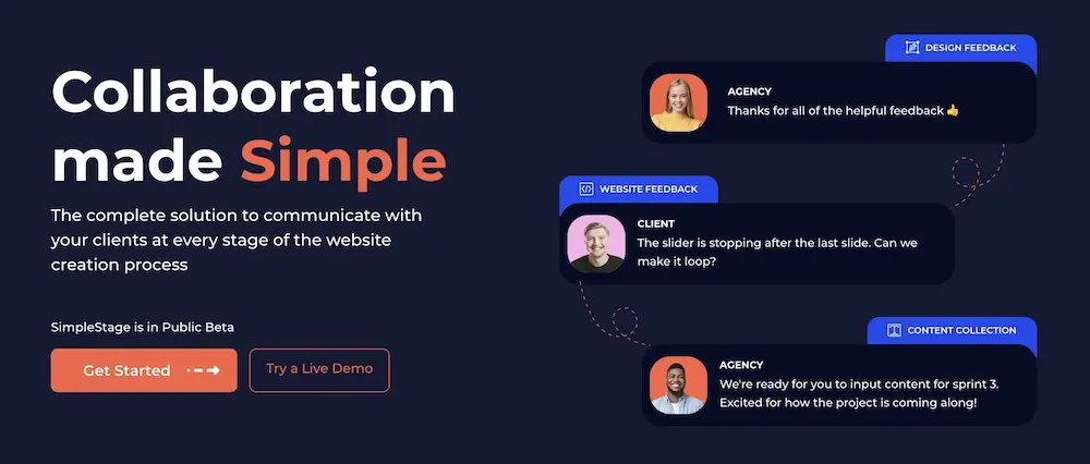
SimpleStage is a collaborative platform where web agencies, developers, or designers can work together with their clients through every stage of the web design process.
We developed SimpleStage, and we’re proud to say we put our money where our mouth is. When designing SimpleStage’s website, we honed in on the following SaaS website design elements:
- Movement that mimics how the platform easily connects the various roles that are often involved in the website design and development process
- A value statement on who we are and what we’re offering
- Multiple CTA options above the fold to meet prospects where they are, whether they want to schedule a live demo, start a free trial or get started
- Animated demonstrations of how the platform works
- Design elements that visually showcase how SimpleStage significantly cuts down the time it takes to develop a new site
- A short-and-sweet menu that gets straight to the point
6. Miro
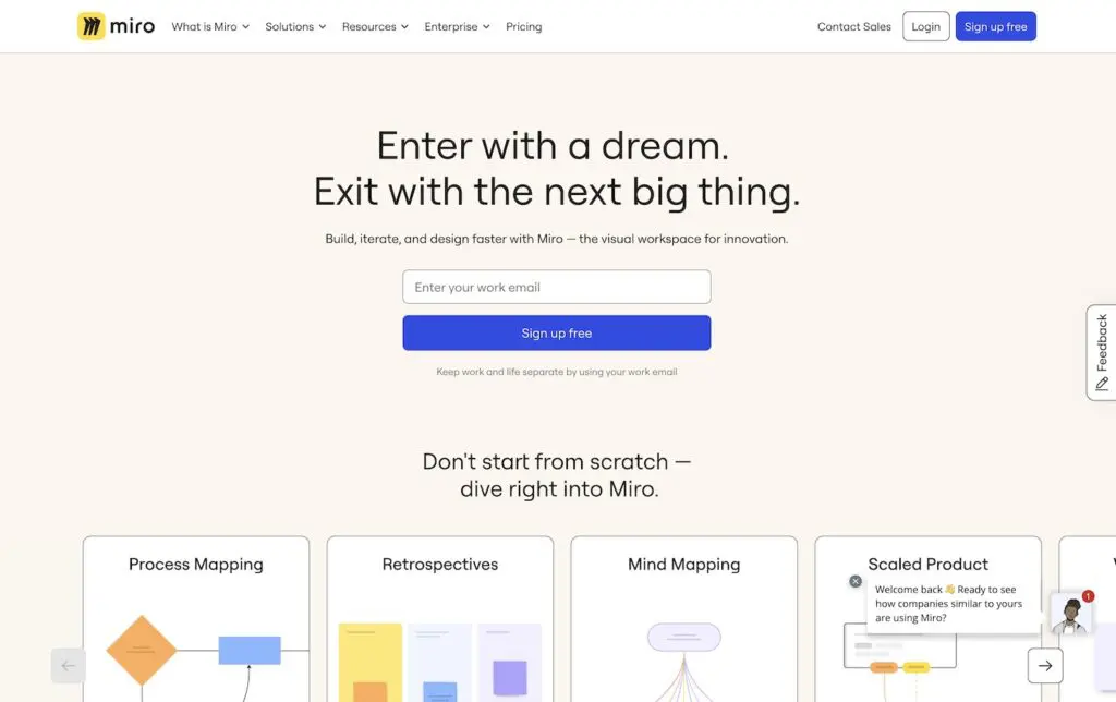
Miro is a digital shared workspace where users can utilize whiteboards, templates and integrations to collaborate on projects individually or in teams.
Miro’s site made our top 12 SaaS website examples list due to its:
- Interactive CTA above the fold
- Use of screenshots to show exactly how the workstation appears when you’re using it
- Clear breakdown of benefits based on visitors’ professional role, team type, industry and objectives
- Ample white space, which continuously fills both sides of the home page
- Use of large, bold text to call out statistics that build trust in its brand
One place we would ding it, however, is its crowded top menu once you hit the drop-downs. All of the text and options under each main menu item can quickly feel overwhelming. For SaaS websites especially, you typically want to push for simplicity and ease of use since those are two factors people look for when shopping for software.
7. Asana
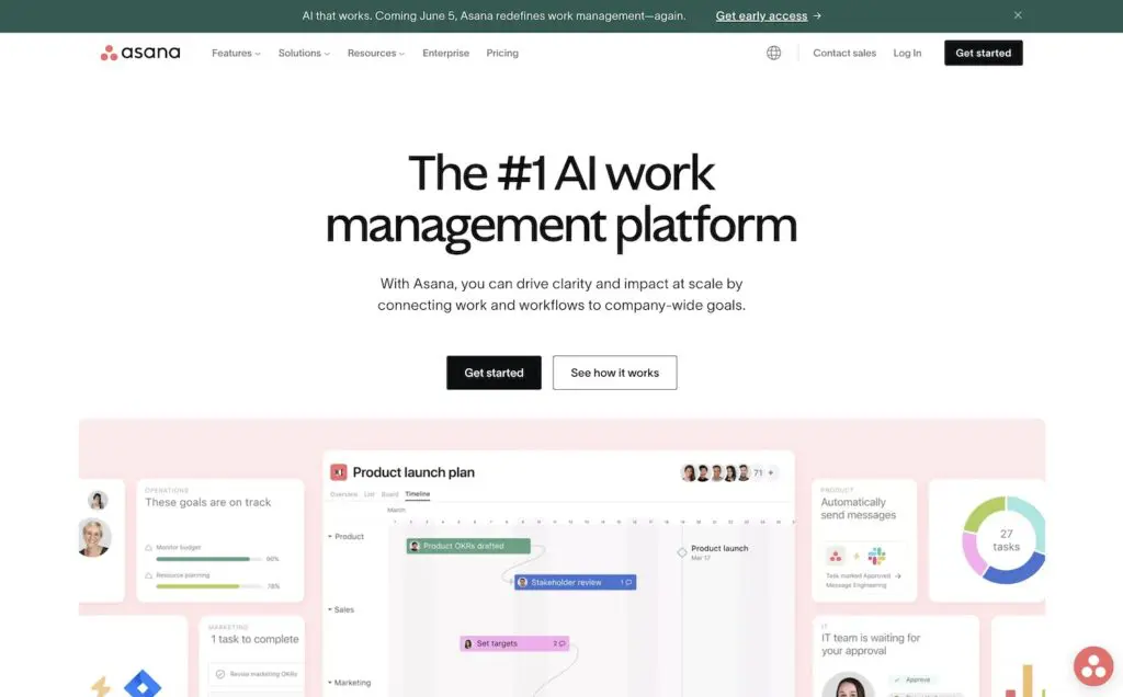
Asana is a project management software solution designed for mobile work management. It assists companies and teams in organizing, tracking and managing tasks and due dates.
We appreciate Asana’s website design because it:
- Uses interactive elements to show how the solution works based on the user’s individual role
- Incorporates an engaging scrolling experience with clear transitions that keep visitors interested
- Uses multiple CTAs throughout the page to meet prospects where they are, including options to view templates, watch a recorded demo and contact the sales team
- Has a real-time chat option in the bottom right corner for quick access to personalized information
- Ends with a clear and distinguished CTA to keep visitors on the site
8. Toggl
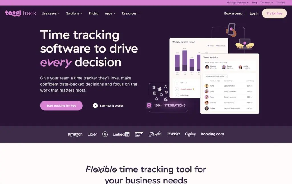
Toggl is widely known as a time-tracking service platform. However, it also offers tools for planning and skill-based hiring.
The design components we appreciate about Toggl’s website include:
- Its unique, memorable branding, especially its uncommon purple and yellow color combo
- Copy that calls out customer pain points associated with accurately tracking time
- Its messaging to ensure visitors know it’s more than just a time-tracking platform
- Its use of color blocks to clearly mark distinctions between sections
A few things we don’t like? Pricing isn’t very easy to find, and the web pages can feel a little claustrophobic and confusing with all of the design elements crowded into the space.
9. Typeform
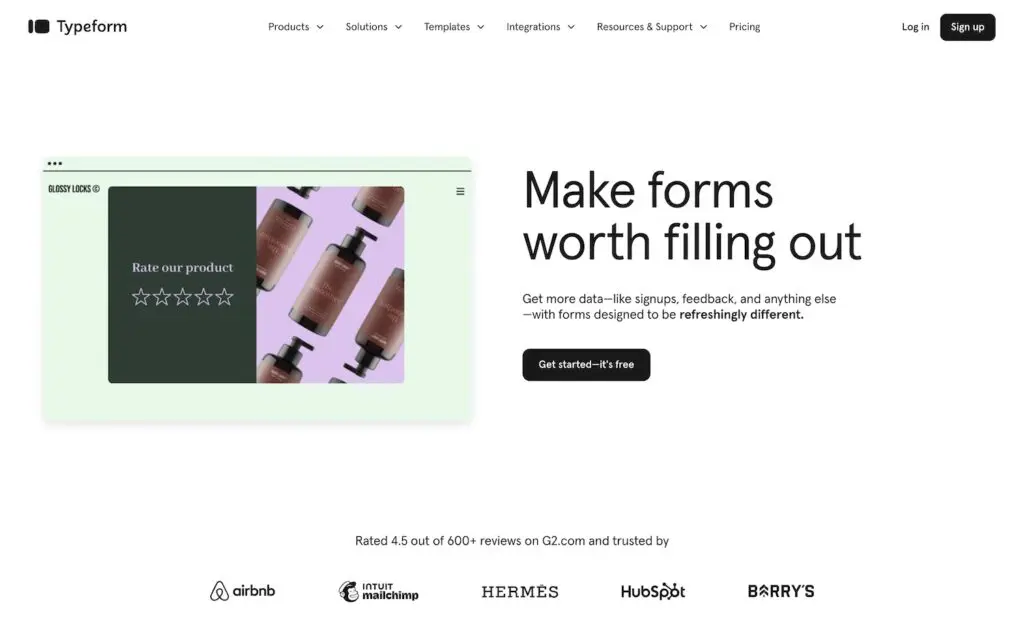
Typeform is a SaaS platform that allows users to develop creative and engaging forms, surveys and quizzes.
They made it into our list of top SaaS website examples because the site design incorporates:
- Quick and clear delivery of who they are and what they offer
- Media above the fold that quickly demonstrates exactly how the platform works – and makes it look easy
- Ample white space, but with interesting design elements that occasionally leak off the side of the page
- Brilliant messaging that is fun, direct and customer-centric
- Quick access to clear pricing
10. Trello
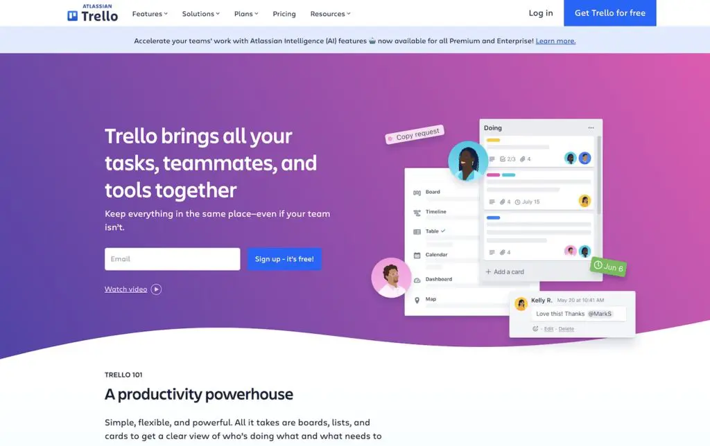
Trello is a work-from-anywhere platform that brings together tasks, teammates and tools.
We enjoy Trello’s website for its:
- Modern design
- Subtle background graphics that add to the design without subtracting from the copy
- Inclusion of pricing on the home page
- Interactive pricing calculator for its enterprise plan based on the number of users
- Unique color scheme and branding
11. Buffer
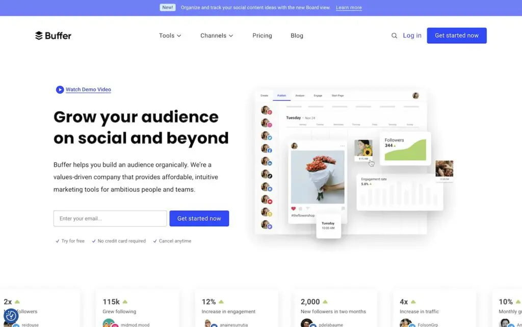
Buffer is a SaaS website that offers intuitive marketing tools to help businesses build their brands organically.
We admire Buffer’s site because it is equipped with:
- Easy navigation, which quickly and clearly outlines the steps for using the product and includes associated CTAs
- Movement in the form of continuously scrolling carousels that offer a unique way to show client successes
- Multiple CTA options above the fold
- A short-and-sweet home page
- Memorable branding that is consistent with its social media channels
12. InVision
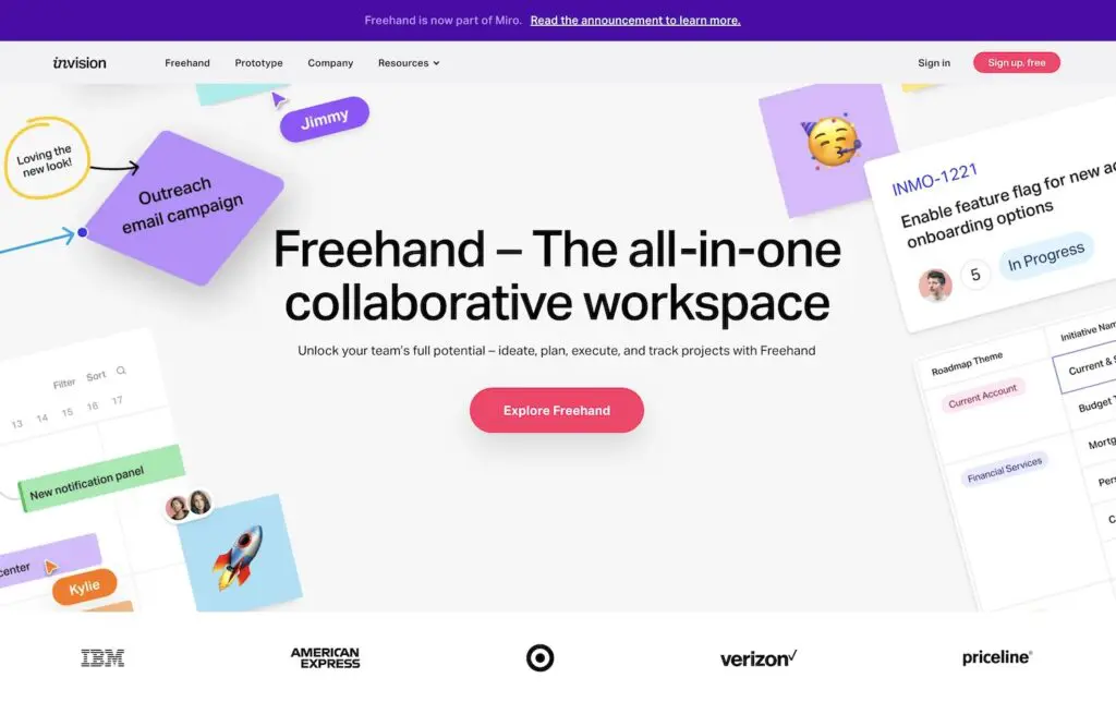
InVision is an online whiteboard where users can collaborate to brainstorm, plan and work.
When exploring InVision’s site, you will see that they include many of the best practices we recommend for great SaaS websites, such as:
- Clear and prominent CTAs
- Video demonstrations
- A home page chat bot for quick answers
- Large, bolded fonts for CTAs and important feature call-outs
- A unique, on-brand design that is decorated like an actual whiteboard, helping to keep the platform’s functionality top of mind
SaaS Website Designs that Convert Visitors
Reviewing other SaaS website design examples throughout your website project is a great way to get inspired and generate fresh ideas that will help you stand out in a crowded industry.
Motion Tactic specializes in planning, designing and developing great websites for companies in the SaaS space. Take your website to the next level – schedule a consultation today!