In this post, we share tips on how to create an effective b2b call to action (with examples).
A call to action (CTAs) is arguably the most important element of an effective B2B website. You can have stellar messaging, a design that demands attention and a top-notch user experience, but if you don’t give your prospects the opportunity to engage with your brand in a meaningful way, is your website really doing you any favors?
A call to action is an invitation to your prospects to take the next step in their purchasing journey by asking them to complete a specific task. When you think about B2B call-to-action examples, you likely think of a “Contact Us” or “Learn More” button, but there is so much more to B2B CTAs than those lackluster examples.
We’ve put together a guide to help you craft and design a B2B call to action that will convert more of your prospects into paying customers.
How Does A B2B vs. B2C Call to Action Differ?
You’ll notice in this guide that we’re specifically emphasizing B2B call to action buttons. That’s because there are some big differences between which CTAs will work for B2B customers vs. B2C.
For starters, the B2B buying journey is different from the B2C customer journey. For example, the B2B purchasing journey often:
- Involves more research by the purchaser before a decision is made
- Has a longer sales cycle than B2C purchases
- Requires additional input and/or approval from multiple stakeholders
- Targets different customer personas
- Tries to accomplish multiple objectives based on where the buyer currently is in their purchasing decision
Because it’s important to cater call-to-action buttons to your specific audience and offering, the best CTAs – and often the entire website structure – for B2B websites will look vastly different than a B2C product, service or e-commerce site.
5 Elements of Effective B2B CTAs
Not all B2B CTAs are created equal, so how do you know which ones are best for YOUR organization? This will take a deep understanding and consideration of your target audience and their motivation for considering your product or service.
While a B2B call to action should be catered to your business, there are a few best practices you can use as a launch pad.
1. Offer Instant Gratification
Depending on the level of investment required, B2B sales cycles can be long. What can you offer your prospects that will give them immediate gratification if they’re not yet ready to purchase?
One great way to do this is to add a timeliness element to your call to action. For example:
- “Take our 5-minute quiz”
- “Download our free how-to guide now”
- “Chat with us live”
- “Start your 7-day trial”
Other examples of a B2B call to action that focus on instant gratification include offering a free add-on service when a user signs up for your email list or offering a pre-recorded demo they can watch immediately instead of scheduling a live demo in advance.
2. Focus on One Specific Action
B2B CTAs should always focus on one action you want your prospect to take. Offering multiple options at once can be confusing and make it less likely that a user will take any action at all.
It’s also best to be specific and to make it easy for your prospects to take the desired action. This can often be done with a call-to-action button that leads directly to a contact form, quiz, video or landing page that contains content that is directly relevant to the action they’ve taken.
For example, if you want your prospects to learn more about a specific feature for your SaaS product, you might lead them to a landing page that focuses solely on that feature. The CTA in this case might be, “See this feature in action” or “Sign up for new feature updates.”
3. Use Meaningful Messaging
Your website visitors will only engage with your brand if they feel they have something to gain from doing so. This is why it’s critical to understand your particular audience.
Ask yourself:
- What are their motivators?
- What are their pain points?
- Why should they choose your product or service over the competition?
- What do they value?
- How would your product or service be integrated into their existing business structure or workflows?
Ultimately, you are trying to convince them that your B2B product or service can help make their life easier. To do that effectively, you must understand what their daily work entails.
For example, if you’re selling a SaaS product that helps companies understand their website traffic, your visitors are motivated to find a tool that can help them see what visitors are doing on their website. As a CTA, you could invite them to input their site URL in exchange for preliminary information about their site’s performance.
This example speaks directly to their motivation AND offers the instant gratification of seeing their own site’s performance and how your software works.
4. Place Them Strategically
Your website should tell a story, and it should go something like this:
- Acknowledge your customer’s pain point(s)
- Explain how your offering can solve it
- Share a little about who you are and what makes your solution different than competitors
- Maybe share a few case studies or stats that give your solution added credibility
- Encourage a purchase
Your CTA buttons should be placed where it makes the most sense based on the action you’re trying to get your user to take.
For example, it makes more sense to add a CTA to “Start Your Free Trial” after you explain how your offering can solve their problems than it does to place it directly under a section that only acknowledges their challenges.
Similarly, a CTA to “Download a Comparison Sheet” that compares your solution with competitors should match with the section where you outline your differentiators as opposed to being placed at the very bottom of the page.
Aside from ensuring your CTAs align with your content, you should also ensure you place a compelling call to action in the following places:
- “Above the fold” of your website, which refers to placing your call-to-action button at the top of your page before a user even has to scroll
- At the very bottom of your page, so your visitors clearly understand what they need to do next
- At the end of your blog posts
- In any pop-up messages that show when a user first lands on your site
- If possible, a CTA should be visible at all times while scrolling
5. Lean on Data
The best thing about using a B2B call to action is that they’re trackable. It’s always a good idea to A/B test your CTAs to see which ones convert more leads. This helps to take the guesswork out of which CTAs work best and are most relevant to your audience.
The Importance of CTA Design
Aside from the specific text you use in your B2B call to action, their visual appearance is also important. CTAs should be noticeable and stand out from the rest of your content so they’re easy to find.
A few ways to use web design principles to your advantage when it comes to CTAs include:
- Use big font
- Use a different background color for your call-to-action button than is used on the rest of your site
- Utilize white space around your CTA to help it stand out
- Make your call-to-action button actually look like a button
- Use defined borders for your button
- Use contrast colors
- Incorporate motion or animation that calls attention to it
Your CTAs should be easily recognizable so that it’s obvious to prospects that they’re hyperlinked.
B2B Call-to-Action Examples
Perhaps the best way to demonstrate the effectiveness of well-thought-out CTAs is by sharing real-life B2B call-to-action examples. Here are a few that stood out to us.
Semrush
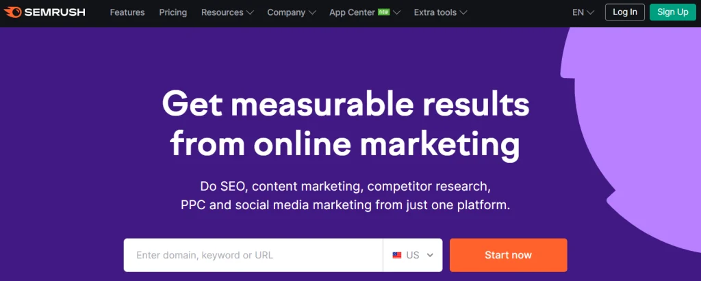
Used to identify keywords and online ranking data, Semrush allows visitors to immediately test the platform out for themselves by offering marketing campaign data related to a specific site URL or keyword of their choosing.
This CTA speaks directly to the motivation of Semrush’s prospects, who are likely looking for a tool to help them better understand how they can improve the ranking of a specific site.
Monday.com
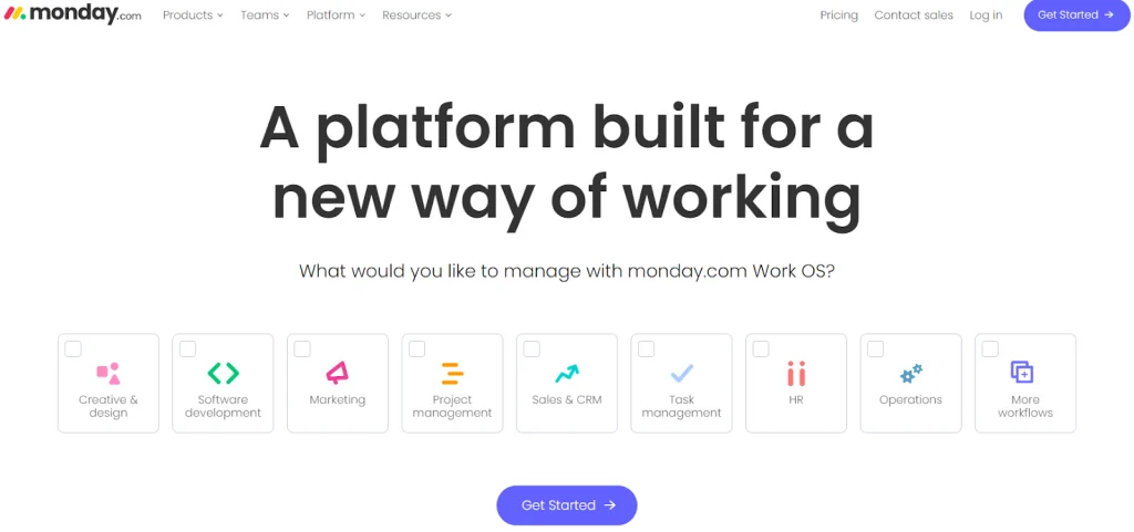
A project management software, Monday uses a single CTA of “Get Started” but enables users to customize the information they receive based on the features they need most. This makes it easy for prospects to find the information they’re looking for while also learning about all that Monday has to offer.
HubSpot
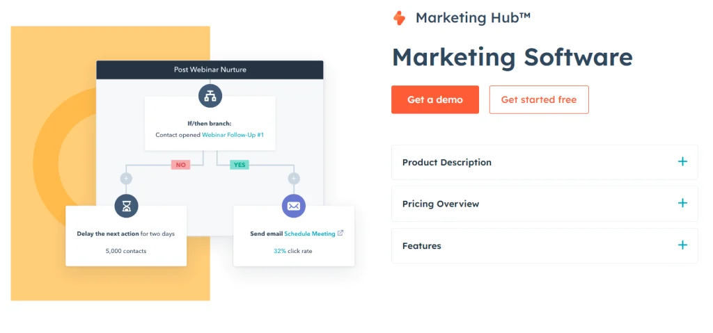
HubSpot consistently uses two call-to-action buttons across their site:
“Get a Demo”
“Get Started Free”
We like this example because it accounts for the fact that not all visitors are at the same point in their buying journey.
If a prospect is in the beginning stages of researching their options, a demo is a good first step. If they’re already familiar with HubSpot or have already narrowed down their choices, trying the platform out for free might be the last step needed before they make a purchase.
SimpleStage
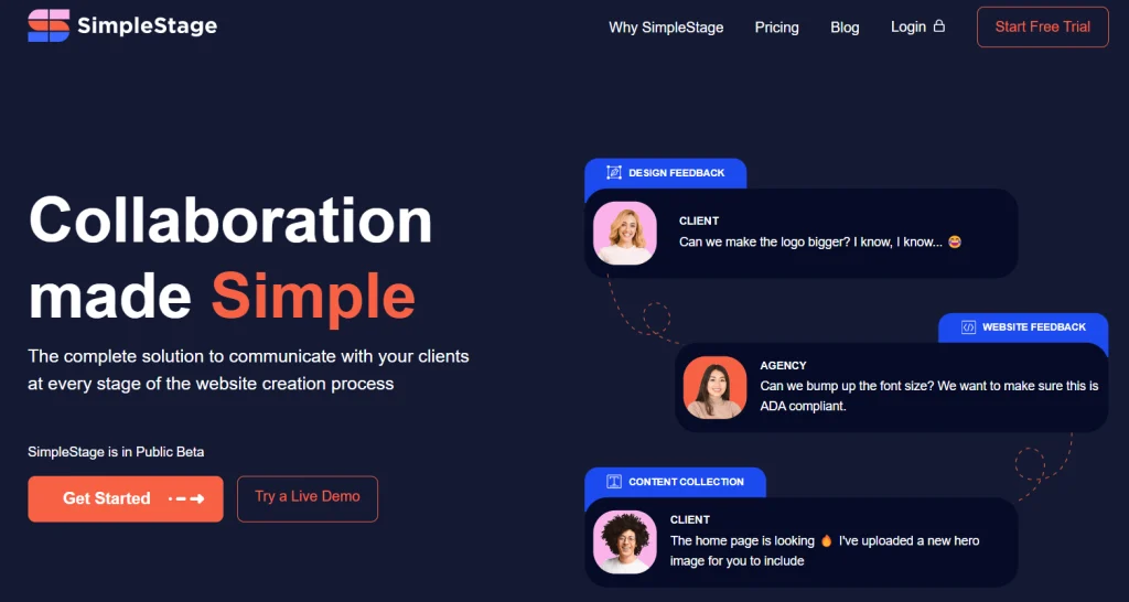
SimpleStage, a collaboration platform for web designers and their clients, offers prospects the opportunity to try a live demo of the platform immediately instead of scheduling one in advance. This is a great no-risk way for prospects to try out the product before involving any sales reps.
Turn More Visitors Into Conversions
A well-written and well-placed B2B call to action is vital to your website’s performance, but it’s only one piece of a broader puzzle. Motion Tactic specializes in guiding clients through a B2B website strategy, design and development that all work together to win more of your best customers.