In the highly competitive world of B2B SaaS, having a well-designed website makes all the difference in attracting and retaining customers. As technology and user expectations evolve, so do B2B website design trends. Keeping up with the latest trends can help your company stand out from the crowd and stay ahead of the competition.
B2B Website Design Trends
In this post, we’ll explore the modern B2B website design trends you can’t ignore if you want to succeed in the world of SaaS. While trends can change over time, staying up-to-date with b2b website design trends can have a positive impact on your website’s user experience, credibility, and overall effectiveness in engaging and converting B2B customers.
Your B2B website serves as the primary avenue to generate leads and foster customer interest. By aligning with these trends, your business demonstrates a commitment to client’s satisfaction and ultimately shows your company cares about how your customers feel.
From navigation structure to color trends to social proof ideas, here are key features that not only look great but also help drive conversions.
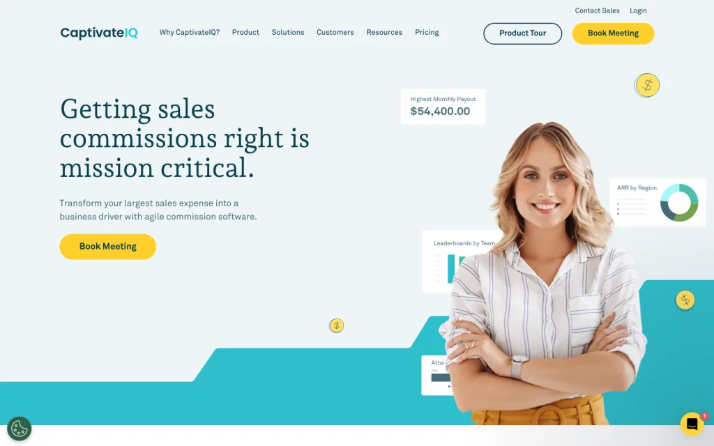
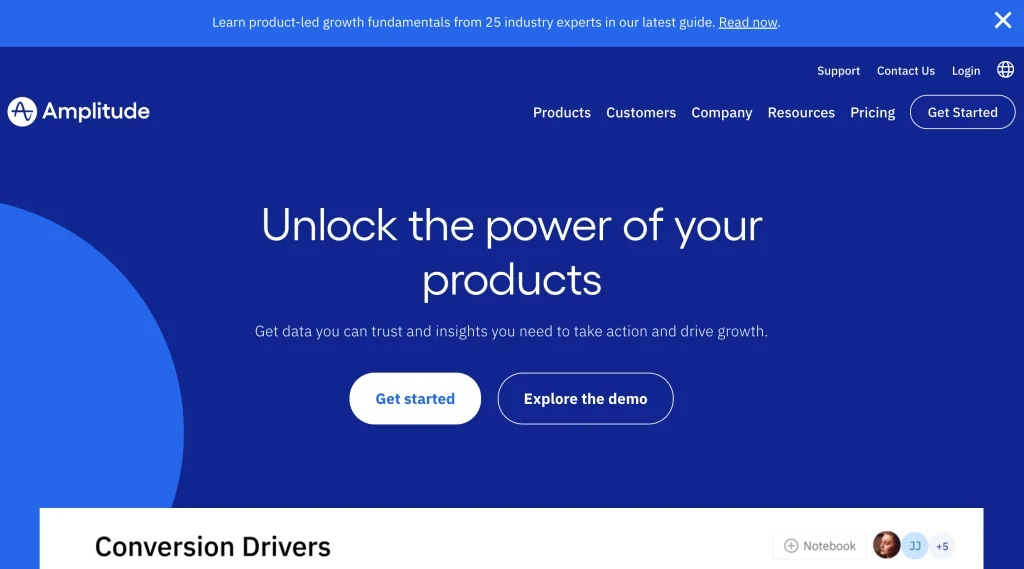
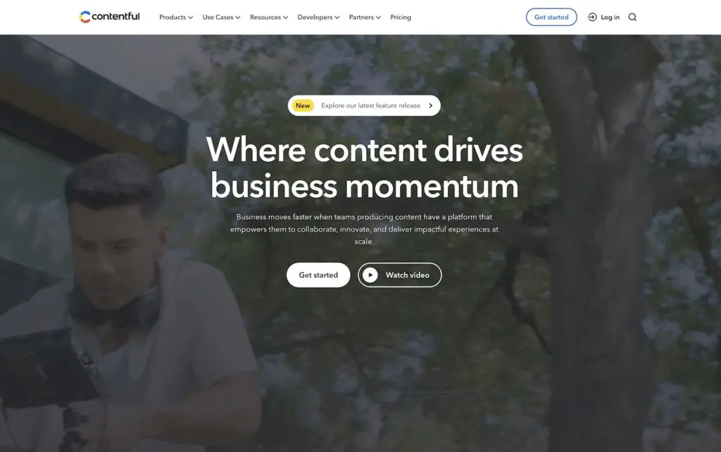
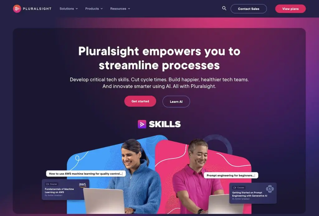
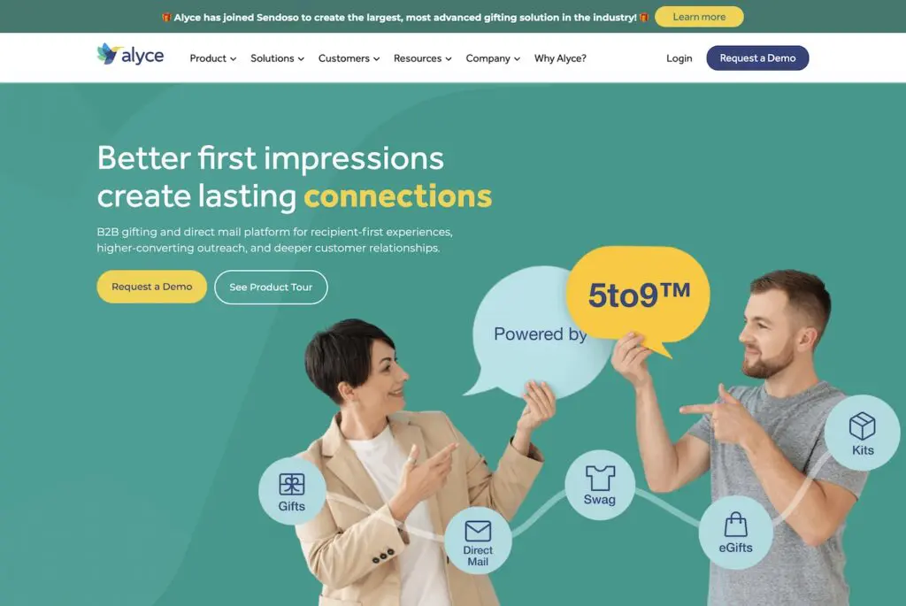
1. Call to Action Buttons That Pop
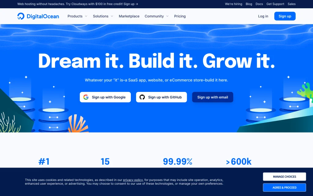
Call to action (CTA) buttons are an essential element of any website, and especially for those in B2B SaaS. To be effective, though, CTA buttons must stand out in your web design.
In today’s fast digital world, where attention is short-lived, CTA buttons are like virtual handshakes linking businesses with potential clients. This is especially true in B2B SaaS, where complex solutions need careful attention. These buttons spark meaningful interactions.
More than just looking good, CTA buttons strategically nudge visitors from observers to active participants. By using bold colors consistently throughout the web pages, B2B sites can create a smooth user experience that leads prospective customers towards important actions. This builds engagement and trust, crucial in today’s B2B landscape.
Many B2B websites are leaning into this conversion-driving trend, incorporating buttons in eye-catching colors that break away from the rest of the website’s color palette. It’s also a common practice to feature the same bold button style throughout the entire site. This helps create consistency and draw attention to the main action you want users to take, no matter where they are on your website.
2. Subtle Secondary Hero CTAs
A new trend we’ve utilized is having a secondary CTA acts as a gentle guide for website visitors who might not be ready for the main action. It offers an alternative option that still moves them closer to the primary conversion goal. In the realm of B2B web design, these secondary CTAs are a valuable addition, providing a pathway for engagement when the primary action isn’t the immediate fit.
Skillful SaaS web designers strategically position secondary CTAs alongside the main one, often within the homepage hero section. These secondary prompts, like “See Pricing,” “See Plans,” or “Try Free,” are designed to be less bold than the primary CTA, while still harmonizing with its button style. This thoughtful approach respects the user’s choice while ensuring they’re guided towards meaningful interactions that contribute to the ultimate conversion objectives.
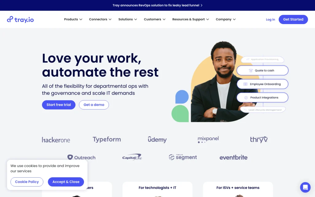
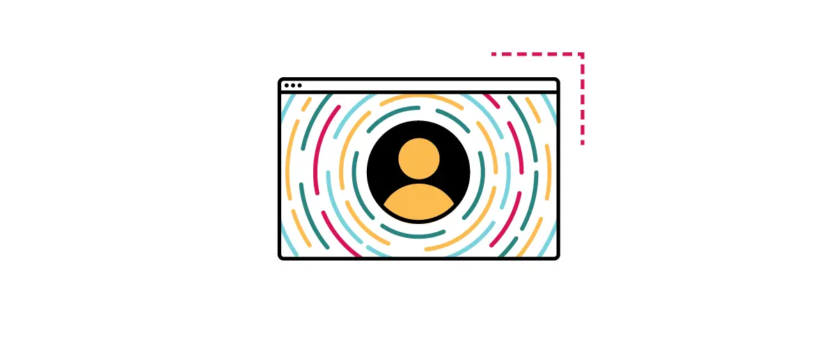
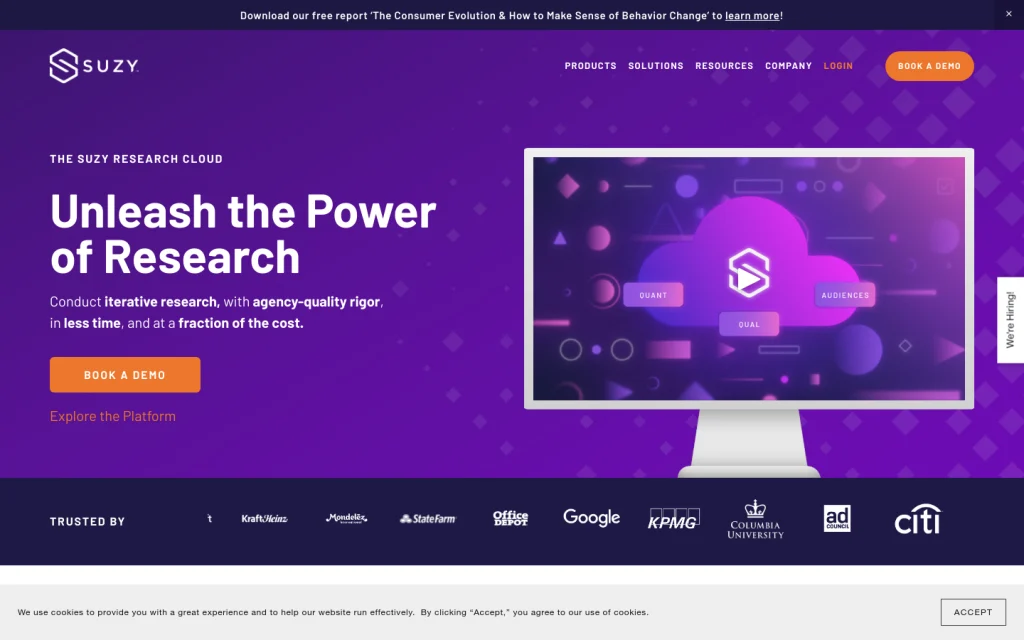
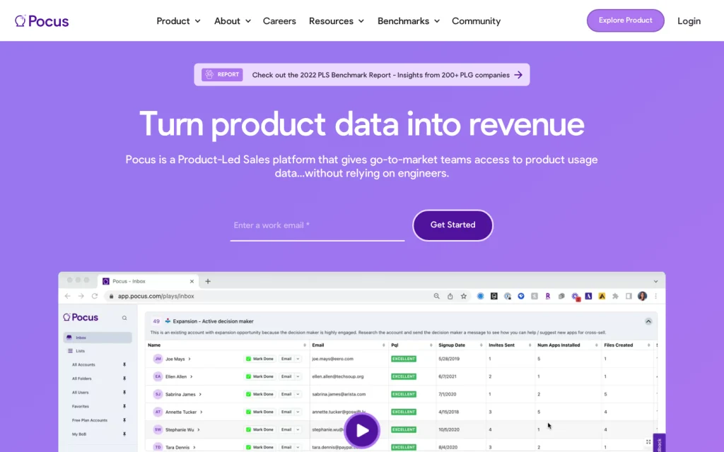
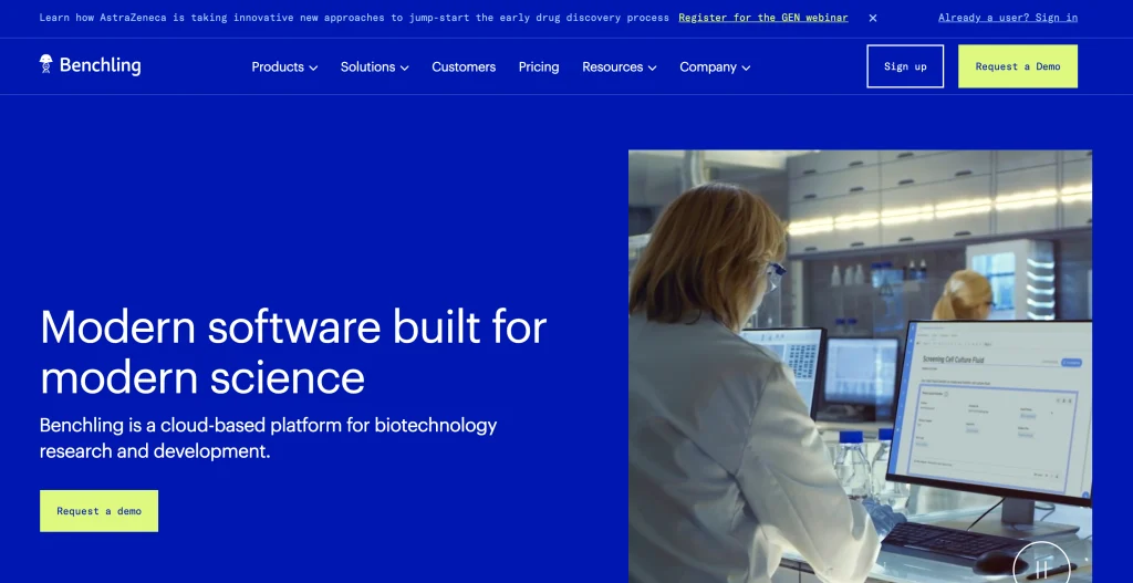
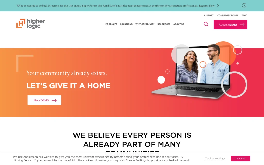
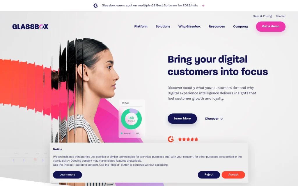
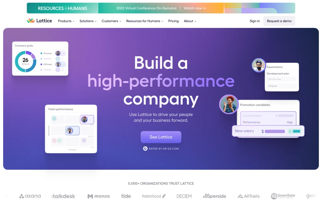
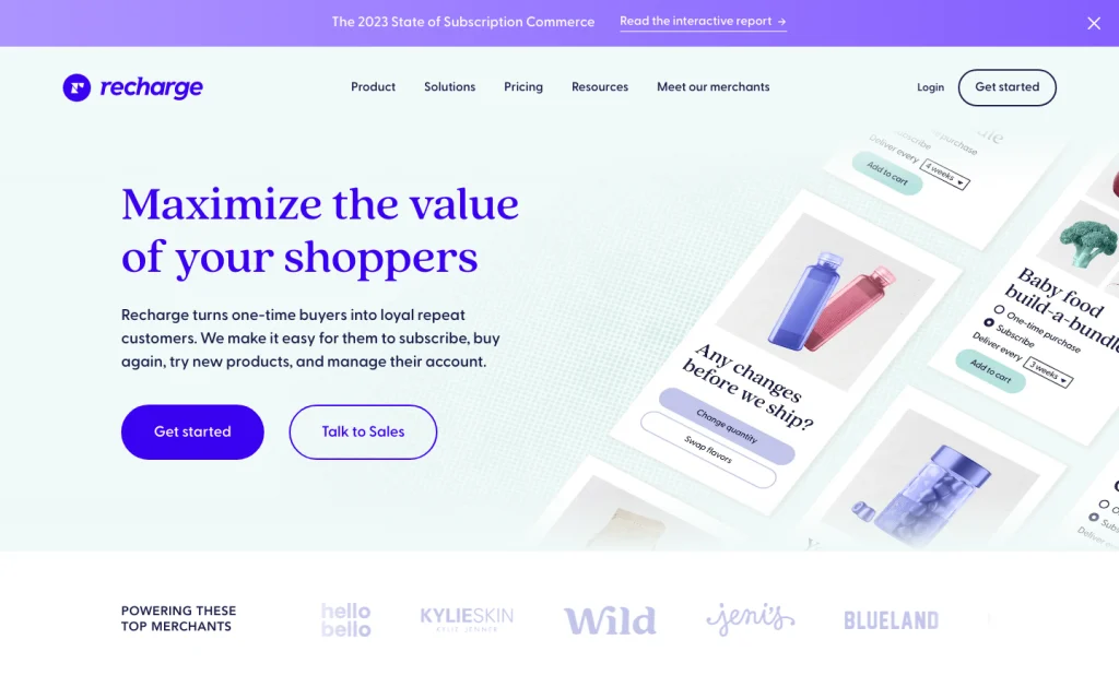
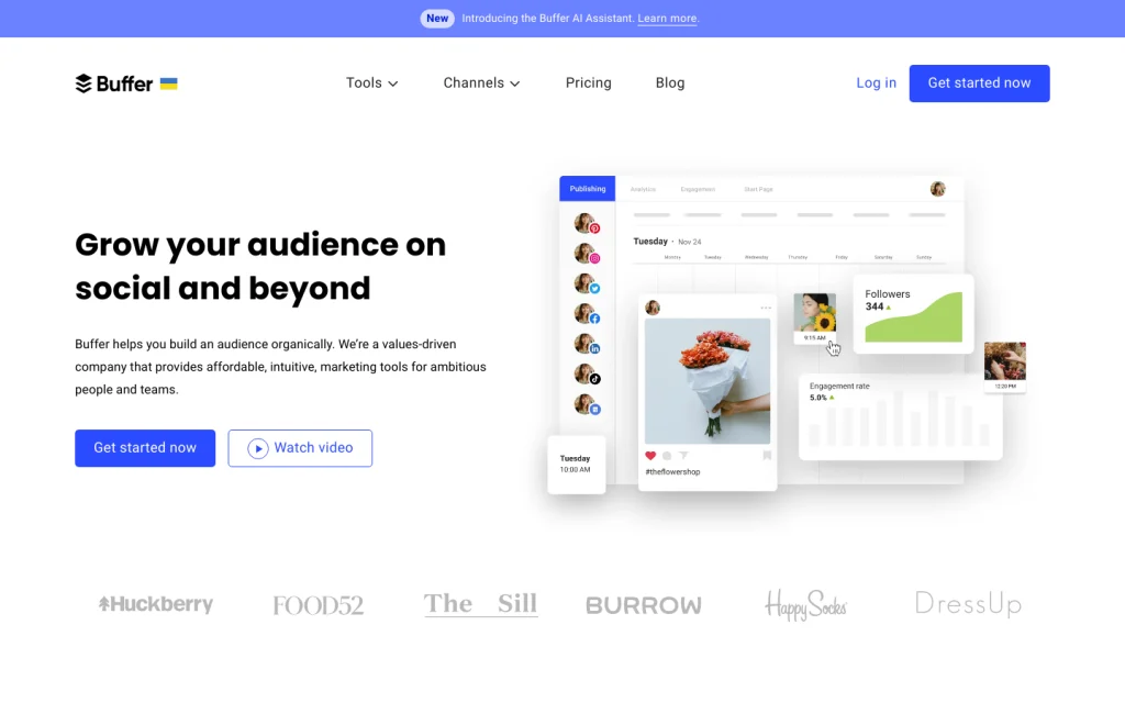
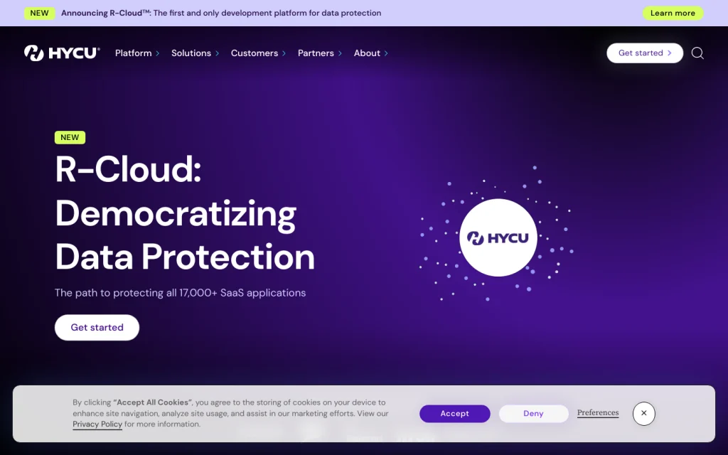
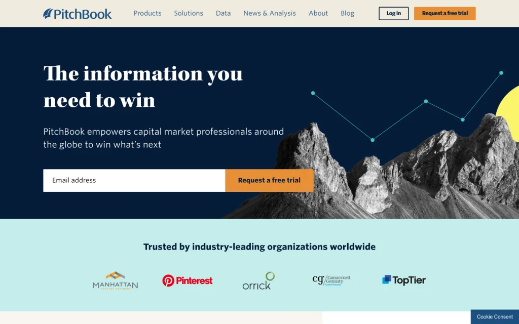
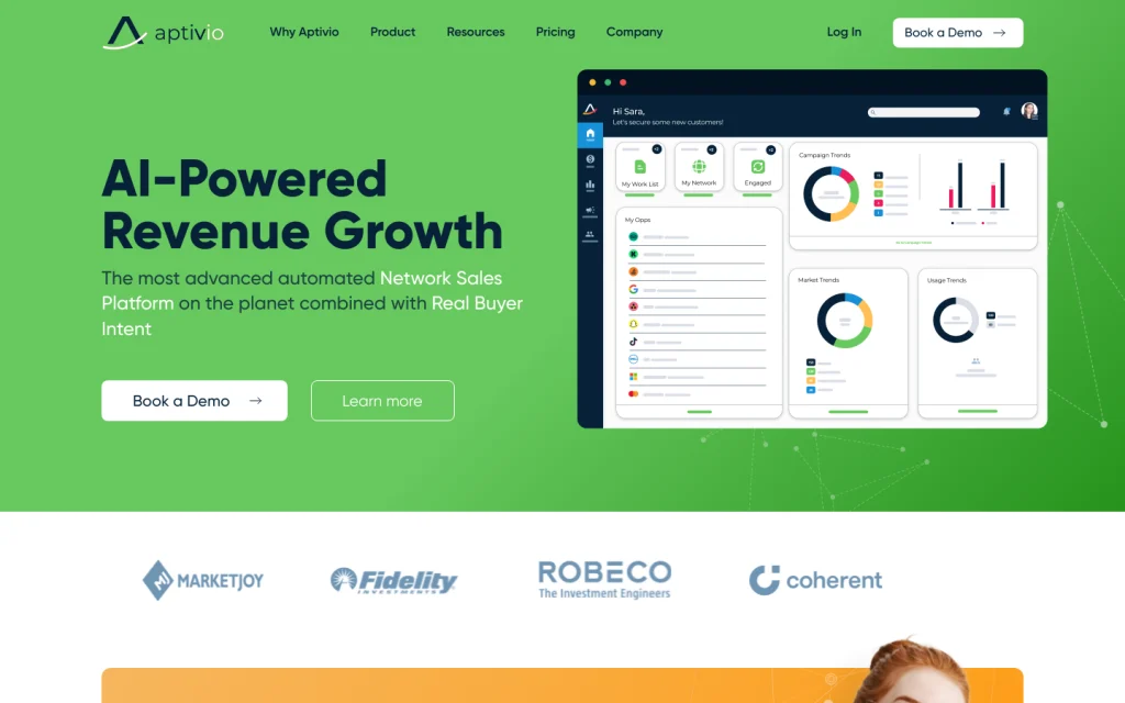
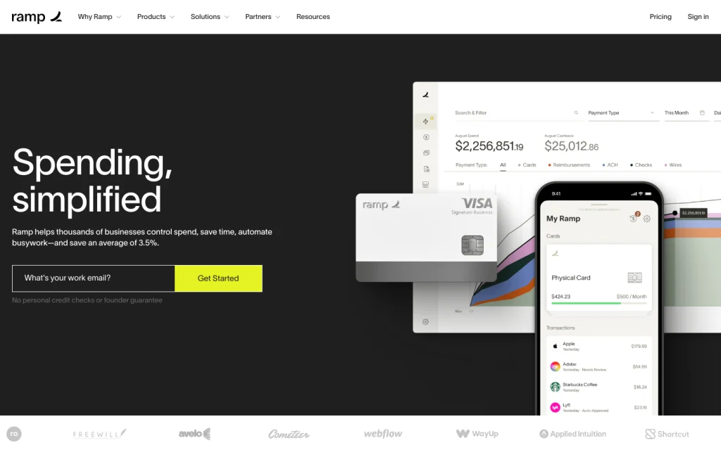
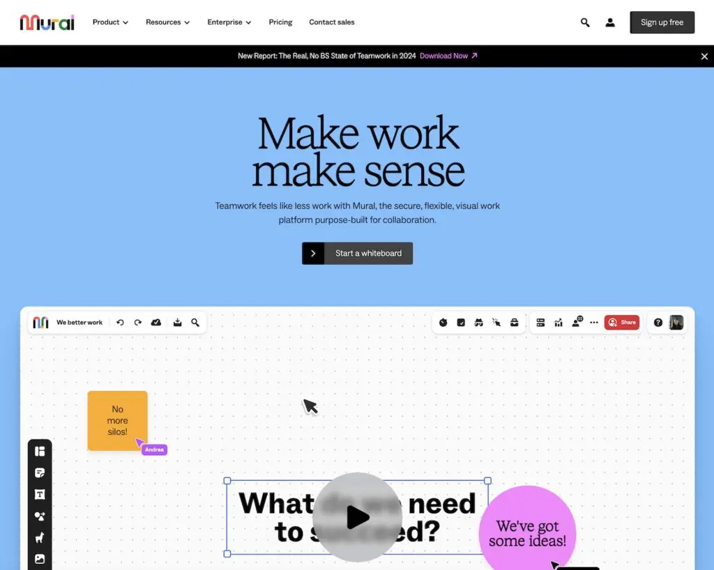
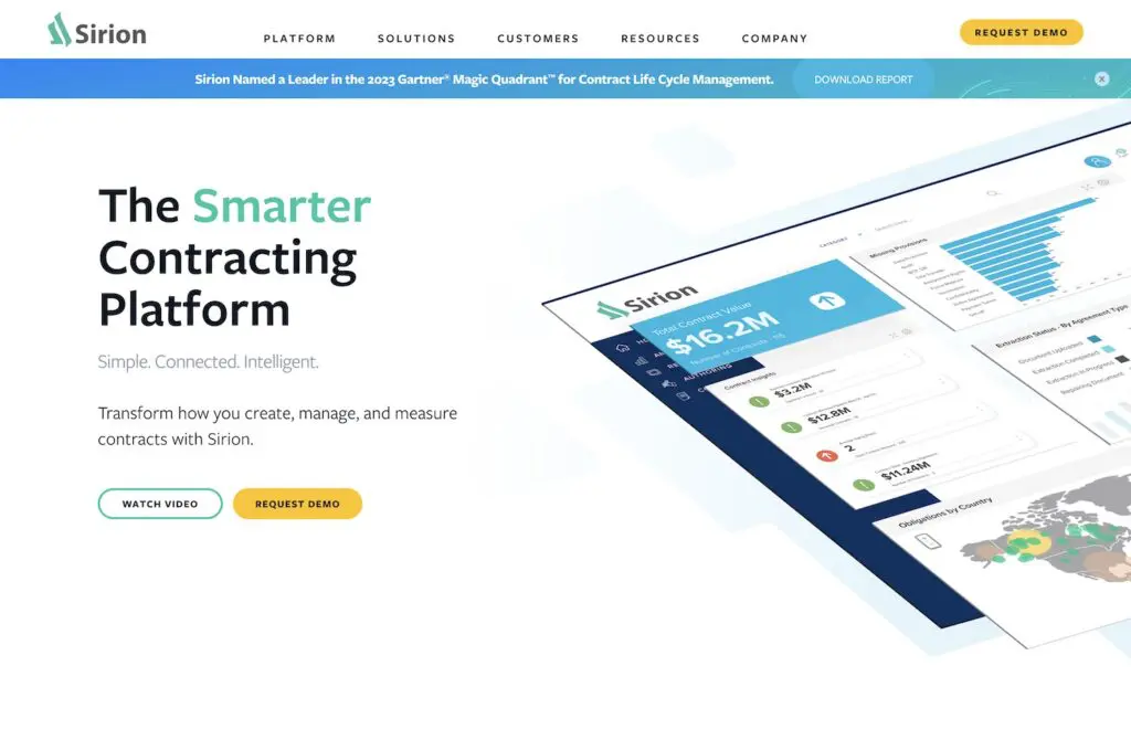
3. Bold Color in the Homepage Hero Section
The hero section of a website is the first thing your target audience sees when they land on your website. It typically contains a high quality images or video content, a headline, and a call to action. To make a lasting first impression and capture user interest, many B2B SaaS companies introduce a bold section as the first thing on the page.
Bold colors are crucial in a B2B website’s hero section because they command they user’s attention and bring more vibrancy to the web design elements. In the often-serious B2B landscape, bold colors inject a sense of creativity, helping to differentiate the brand and captivate visitors from the moment they arrive.
These striking hues leave a lasting impression, conveying confidence and fostering brand recognition, all while guiding users towards key actions and content.
Web designers use bold colors in contrast to white space to help create a strong visual impact and convey a sense of energy, excitement, and confidence about your brand. By using bold brand colors in the hero section, you generate interest right away and encourage readers to keep going down the page.
4. (On That Note) Trending Color Schemes
Color is a powerful tool in web design and can significantly impact visitors’ perceptions and emotions. Trends arise from user preferences, making your site feel current and in touch. Following these trends isn’t just a surface change; it connects your site to the now, instantly resonating with prospective clients.
By blending in today’s color choices, you signal awareness of modern web design. This isn’t just about the website – your brand also benefits. It shows that you’re not only up-to-date but also aligned with design evolution. Picking the right colors reflects your commitment to providing a modern, engaging, user-focused experience.
Some common color schemes being used on B2B SaaS websites today include pink and orange, purple and white, blue and white, and purple and black.
But beware.
If your goal is to stand out from the competition, you may actually want to avoid these trending B2B color schemes or encourage your visual design team to find unique ways to implement them to ensure a distinctive brand identity.
Pink and orange
Purple and white
Blue and white
Buffer
Purple and black
5. Color blocking
One of the B2B website design trends that aids in both aesthetic and site organization is color blocking. Web designers use color blocking to differentiate between page sections, which creates a visually striking and organized layout. This technique is great for highlighting important information and creating a clear hierarchy of content.
Color blocking can also help with accessibility (ADA compliance), which is becoming a priority for an increasing number of companies. This is because creating a high contrast between foreground and background colors makes it easier for users with visual impairments to read and navigate a website.
Color blocking is implemented by strategically assigning distinct and contrasting colors to different sections of the web page. Effective web design means choosing colors that align with the brand’s identity and aesthetic while ensuring high contrast for readability and visual impact.
These color-blocked sections help delineate content areas such as headers, text blocks, call-to-action buttons, and more. By maintaining consistency in color choices and contrast levels, web designers create a cohesive and visually engaging layout that enhances user experience, guides website content exploration, and reinforces the website’s overall organization.
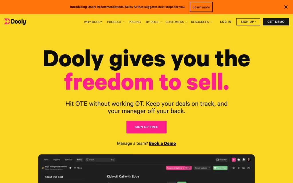
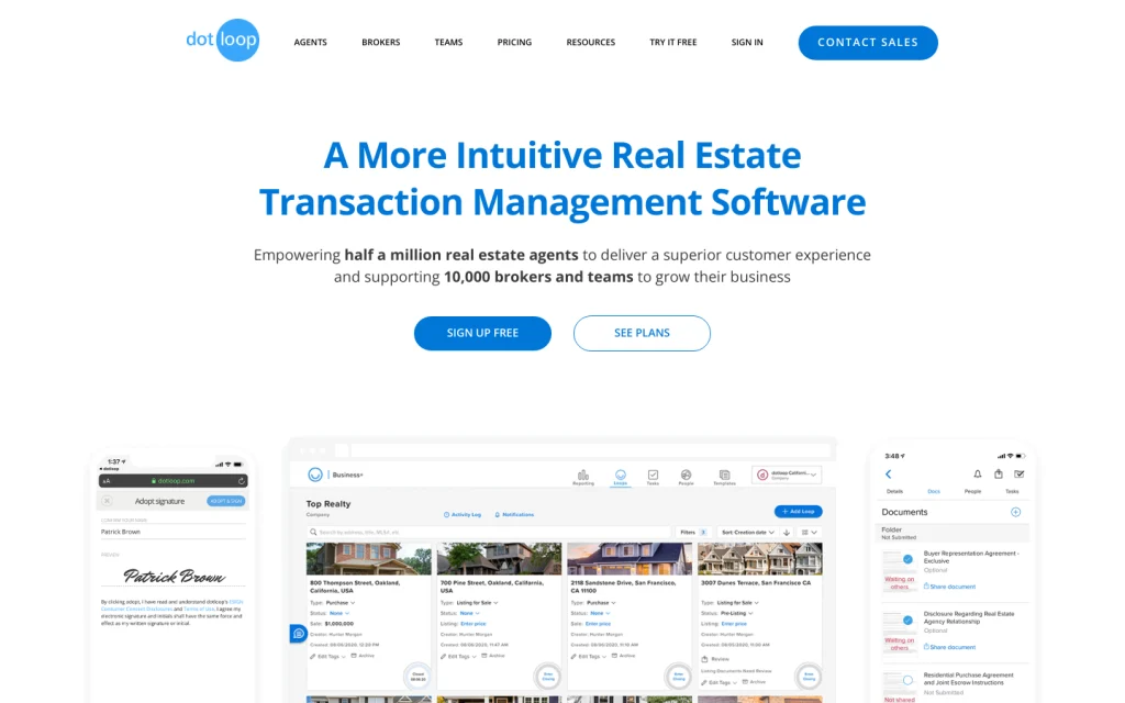
6. Strong, Clear H1 Homepage Copy
As mentioned above, the homepage hero of your b2b website is often the first glimpse visitors get. It’s a critical chance to make a positive impact and avoid confusion by using clear, jargon-free content.
Many SaaS companies rely on this precious real estate to simply state their value proposition. This gives web visitors a clear understanding of what the business offers and encourages them to continue on the site when the copy aligns with the end user.
Employing bold typography for H1 headings can effectively highlight vital messages or titles on your page, capturing reader attention. This technique is especially valuable for crafting clear calls to action or spotlighting key value propositions, enhancing the overall user experience.
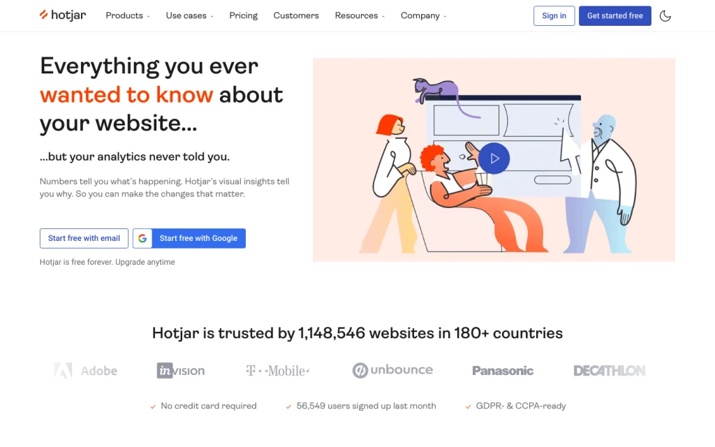
7. Company/Client Logos As Social Proof
Social proof is a psychological phenomenon that occurs when people look to others to determine what is correct, popular, or trustworthy. In B2B web design, social proof is a powerful tool used to increase credibility, trust, and conversion rates.
A great example of this is when B2B SaaS websites have a social proof section that includes the logos of past and present companies that have used your product or service. Whether the companies are household names or not, these logos confirm for website visitors that others are in fact engaged with your brand.
One other important note when it comes to logo sections and B2B website design trends is the placement of these social proof sections. Many SaaS websites value them so much, that they include them right after the hero section on their homepage. This allows decision makers to see more depth of your company’s story without having to make it very far down your home page.
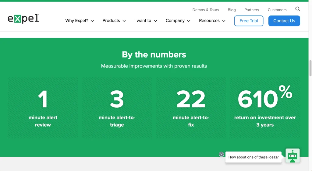
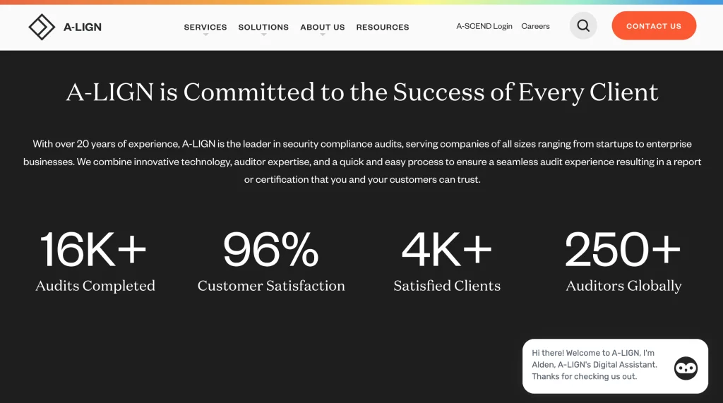
8. Quantifiable Data As Social Proof
Another common social proof section used in SaaS web design is a data or stats section that validates a platform or product for a user. If your company can measure the success your product brings its users, you should show it off since metrics are a clear way to communicate your value to website visitors. B2B website designs often put a lot of emphasis on these sections, as designers and marketers want this valuable information to stand out.
9. Subtle Section Animations or Even No Animation
When it comes to animation trends on B2B SaaS websites, many organizations are opting to let their website content do the talking. It’s most common to see either micro interactions as a user scrolls down the page or no section animations at all – meaning all the content is already loaded on the page as a user scrolls.
There are many benefits to using a less-is-more animation approach on a conversion-focused website.
- Enhanced focus on your brand’s story
- Reduced cognitive load
- Clear Call-to-Action (CTA) emphasis
- Improved page speed
- Easier for mobile friendly sites
- Enhanced user engagement
- Accessibility
- Less distracting interactive elements
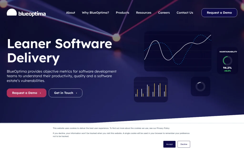
10. Imagery Featuring Product Screenshots or Mockups
While many designers use stock photography, custom photography, and other graphics or icons to add visual interest, the use of product screenshots (or even branded representations if your product design doesn’t match your new website’s branding) on a B2B SaaS website is a trend gaining popularity.
Screenshots help your potential customers understand your product better, because they are a clear visual representation of how it works. Seeing the features and functionality of the product in action also provides more clarity than written copy. This leads to customers having a better sense of what to expect and may lead to higher conversions.
Showcasing how your product works builds credibility too, since it shows that your company is transparent and confident in the product. Following this SaaS website trend may also help differentiate you from your competitors since you can easily highlight unique or standout product features.
11. Streamlined Navigation Architecture
Having a well-structured navigation is crucial for website usability and mobile design, as it can provide users access all areas of the site. The most effective navigations use clear, concise language and provide links to relevant content.
For SaaS websites, there are some common b2b website design trends for navigation architecture. Many site navigations contain somewhere between four and six main menu items. This includes links to common pages for SaaS websites like Product pages, Solutions, Pricing, Platform, and Resources.
The main takeaway from this web design trend is to not get fancy with naming or design for website navigation or overload users with information. Give your website visitors exactly what they expect to find so they can navigate your site as easily as possible.
12. Current Product User CTA Placement
Because SaaS websites often need to cater to potential and current product users, it’s important to consider how the web design affects existing customers. One structural web design trend is to separate the existing customers’ login from the other main navigation items.
These logins are often featured in a utility navigation above the main navigation if space is an issue or are to the right of the navigation near the main CTA button. Either way, using one of these common placement options is important since users will know what to expect once they start using your product.
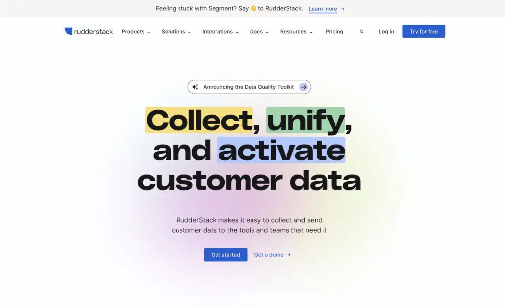
13. CTA Callout Banners
Marketers have many conversion goals on a SaaS website other than users requesting a demo or signing up for a product. A popular tool which has become a new trend is a B2B callout banner. This banner on a website is a prominent and attention-grabbing element often used to highlight a specific message, offer, or call to action targeted towards business-to-business (B2B) audiences.
This banner typically appears at the top of a webpage or in a highly visible location, drawing immediate attention due to its contrasting design, color, and positioning.
The callout banner serves as a focused way to communicate important information to your prospective client, such as special promotions, upcoming events, product launches, thought leadership content, or key value propositions. It’s designed to stand out from the rest of the content, ensuring that visitors notice and engage with the message.
The content of a B2B callout banner is usually concise, using persuasive language to encourage users to take action, such as signing up for a webinar, downloading a resource, or requesting a demo.
The effectiveness of a B2B callout banner lies in its ability to quickly convey relevant information and drive user engagement. By strategically placing these banners on a website, businesses can capture the attention of their target audience, direct them towards specific conversion goals, and promote essential offerings in a visually compelling way.
Learn More About Our B2B SaaS Website Design Process
Motion Tactic is a B2B web design agency that specializes in SaaS websites and B2B website design trends. Our team designs and develops websites for marketers who are looking to make a big impact in their organizations.
We use our expertise to create websites, digital marketing tools, and brands for B2B companies and SaaS companies that are specifically optimized for performance and creative web design. Schedule a consultation to learn more.