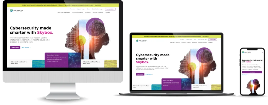
In this post, we discuss what professional services website design trends we are seeing and which to avoid. A few design trends include: large & bold text, engaging scroll experiences, vibrant colors, and interactivity.
“You never get a second chance to make a first impression.”
This famous quote couldn’t be truer when it comes to interactions with your brand. And in today’s digital world, your business’s first impression is often through your website.
Unfortunately, it only takes about 50 milliseconds for a visitor to form an impression of your site, which is long before they ever have the chance to scroll across your stellar content or read your elevator spiel. That’s why an attention-grabbing (yet professional) website design is so critical, especially when it comes to professional service providers like PR firms, cybersecurity, law firms and more.
To ensure an excellent first impression, learn why web design is so important to improving business, and stay ahead of competitors with our roundup of professional services website design trends for 2023.
Why Is Website Design Important for Professional Services?
According to HubSpot, 38% of users say they will stop engaging with your site if its construction, including both layout and content, is not up to par.
Your website’s design alone can make the difference between users choosing to continue on your site, purchase from your site or run to your competitors instead. Well-designed and structured websites offer value in the form of:
- Improved SEO
- Decreased bounce rates
- A stronger brand identity
- Increased leads and conversions
- An improved customer service experience
- Elevated cash flow
You could spend 50 hours perfecting the content on your site, but if the design and user experience (UX) doesn’t draw in your prospects, it could actually be costing you business.
Web Design Trends for 2023
Just like fashion or home design, web design is constantly evolving. A few factors that impact website design trends for professional services include:
- New technology
- Aesthetic trends
- Changes in user behavior and preferences
- Updated design tools
- The popularity of certain content types
- New engagement opportunities
Think of your website as your virtual storefront and your site’s design as your window display. If you want to get people in the door, you’ll need to entice them with the latest and greatest to keep them from strolling right past.
Here are a few professional services website design trends we’ve seen benefit clients so far this year.
Large, Bold Text

Large, bold text is BIG right now, especially when it comes to marketing professional services. This type of typography makes a statement and, depending on the message you choose to present in this way, can quickly:
- State who you are and what you do
- Make clear your value proposition
- Communicate how you solve your prospects’ biggest pain points
- Capture lead interest
Large font is meant to grab attention and create an “Aha! I have found exactly what I’m looking for” moment for your prospects. When looking to incorporate large type into your design, think about what the first thing is that you want your prospects to know. Put another way: How can you convince prospects to stick around using just a few words?
Engaging Scrolling Experiences
When done correctly, the simple act of scrolling can be an interactive, engaging experience for users and keep their attention on your site for longer, providing them with more opportunities to connect and learn about your offerings.
Scrolling experiences may also offer a creative and smooth customer service experience by helping users quickly navigate your site, which is important for UX design.
Engaging scrolling experiences are most commonly used on home pages and can include:
- Simple animations and scrolling-based movement
- Clear transitions between sections
- Text transitions
- Background designs that continue down the page
The point of an engaging scrolling experience is simple: to keep prospects scrolling so they see as much of your content as possible. Your scrolling experience should aim to tell a story, starting with the points that are most relevant to your audiences and ending with a clear call to action (CTA) to enter users into your sales funnel.
Here’s an example of an engaging scrolling experience we recently designed and implemented for a communications firm. Their website design also demonstrates how scrolling experiences can be paired with large font and bold colors to create a unique customer journey.
Pastels or Bright, Vibrant Colors

Color plays a crucial role in 2023 web design trends for professional services. Even if you use compelling typography, website structure and unique scrolling experiences, you can ruin an entire website design with the wrong color choices.
Color has the power to evoke emotion and even cause physiological reactions in users, which can either work for or against you. Pastels, for example, are known for evoking feelings of calmness, openness and balance, which can make visitors feel welcomed by your site.
Popular pastel colors in web design include:
- Mint green
- Coral
- Powder blue
- Wisteria (light purple)
- Mauve
Bright colors, on the other hand, are great at grabbing attention and evoking increased energy levels. They can also be used to draw attention to specific elements or CTAs on your site, create contrast for readability and make your site more memorable.
Examples of bright colors included in 2023 web design trends include:
- Lime green
- Vibrant purples
- Yellow
- Hot pink
- Teal
When it comes to color, it’s always important to prioritize and define the experience you want your prospects to have on your website and their preferences. For example, some people view bright colors as irritating while others may view pastel tones as boring.
It’s also important not to overdo it on either end of the spectrum. Vibrant colors can quickly become too busy, harsh or hard to follow. You don’t want to overstimulate visitors or create confusion about where their attention should be focused.
Lots of Movement
Incorporating simple movement into your web design is a great way to help users navigate their way through your site and draw their eyes to the most relevant pages or engagement opportunities.
Additionally, visual movement is great for helping users make decisions and perform actions that might have otherwise been overlooked.
Examples of movement in web design include:
- Hover effects that transform something on the page when a user’s mouse scrolls over it
- Interactive carousels that can create emphasis
- Scroll-based animations
- Value changes that count up to large numbers, which is great for calling out compelling statistics
- Dolly and zoom effects
- Offset and delay animations, where elements transition in at different rates before landing together on the page
- Buttons that automatically jump users to certain parts of the page
- Text and section transitions
Interactivity
Website engagement always impacts sales and increases brand awareness, both of which lead to higher conversion rates. If users are engaging with your website, it’s a good indicator that they find the information useful.
This is why increased interactivity is a popular trend for 2023 for both website design and digital marketing.
Website interactivity includes when prospects:
- Scroll
- Click on links
- Watch videos
- Engage in live chats with customer service teams
- Schedule consultations
- Download materials
- Sign up for newsletters or emails
Providing users with opportunities for engagement helps them feel more connected to your brand and generates more leads.
Organic Shapes
Geometric shapes in web design, like rectangles, pentagons or anything with straight lines, are a thing of the past. Shapes certainly still play a large role in cohesive web design, but in 2023, you want to implement more organic shapes (sometimes referred to as fluid shapes).
Organic shapes mimic things you might see abstracted from nature, such as water, plants or hills. Using shapes drawn from nature helps bring more of a human touch to your site since the shapes are inspired by life.
Thumb-Friendly Navigation

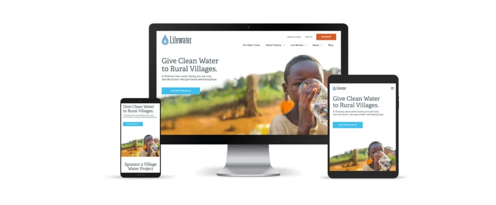
We live in an on-the-go world, so one of the most important professional services website design trends this year is to ensure your site is not only mobile-friendly, but thumb-friendly.
It’s critical to make sure that your site is compatible for all mobile devices and easy to navigate with your thumb, no matter the size of the device. Thumb-friendly navigation supports your user experience, which in turn increases engagement and leads.
Website Design Trends to Avoid in 2023
Just like other creative industries, web design also has trends that quickly become obsolete and can make your website appear outdated. This can signal to potential customers that your company may not be as innovative or technologically advanced as competitors, which can be detrimental to professional services businesses like digital marketing agencies and tech support providers.
Here are some web design trends you should consider avoiding in 2023.
Cluttered Content
Website users today expect an intuitive experience, and the best way to deliver on that expectation is by keeping your professional services website clean and easy to follow. While you may be tempted to utilize all of the top design trends on your home page, adding too many design elements can quickly crowd the space, making it difficult for visitors to discern where they’re supposed to look first.
In 2023, minimalism rules. Be sure to include negative space – also called white space – around the most important elements on your site (especially on landing pages) to help them stand out.
Large, Uncompressed Photos & Graphics
Large images are on their way out because faster website load times are on their way in. It takes time for a website to load large files, and your prospects won’t wait around.
Today’s web users are all about finding exactly what they need as efficiently as possible. You don’t want to lose prospects to competitors simply because your load time is longer.
Multiple Fonts
Your website is central to building your brand, and consistency is what makes your brand recognizable. Using multiple fonts can break the cohesion of your site and distract prospects from the message you are trying to convey or the actions you want them to take.
Why Hire a Website Design Agency?
Website design and development agencies stay up to date with the latest web design trends and know what elements will best help achieve your business goals. It’s one thing to make a website look good – it’s another thing to strategically design a site to optimize your sales funnel.
Web design companies:
- Have the skillset and bandwidth to ensure you have the highest quality website that is both appealing and easy to use
- Have the experience of working with other professional services companies to know what works well in the industry and what doesn’t
- Are structured to move projects along more quickly with a better result
The highest return on investment for companies, however, actually occurs when both an expert agency and an internal website manager work together on the design to ensure it’s consistent with your company’s vision.
Having a website manager on your internal team will also allow you to make quick and easy content tweaks and updates to your site after the initial design and development period.
Trend-Setting Web Design for Professional Services Companies
The bottom line is that first impressions matter, and you have very little time to get it right. Don’t lose out on increased business due to poor web design.
At Motion Tactic, we believe your site should both look great and serve people. Our web design process involves:
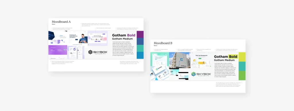
- Creating mood boards to help us better understand your brand’s aesthetic
- Constructing wireframes to place and prioritize content
- Working through design sprints to continuously receive your feedback
If you’re ready to upgrade your professional services website with the latest web design trends for 2023, schedule a web design consultation now.


