Customer centric websites are leaving brochure websites in the dust. But what’s the difference between a customer centric website and a brochure website?
Customer Centric Website: designers, developers, and copywriters work closely as a team to make sure each section of the website provides information that helps a user do their job better. Clear copy and resource rich. Customer centric websites drive leads to the sales team that are ready to buy.
Brochure Website: lacks information about how a product or service addresses a user’s needs. Doesn’t provide enough information and detail about the product’s features. Uses confusing language that the CEO likely wanted. A classic brochure website pushes users to request a demo everywhere on the website. The thinking is that we just need to get a high volume of leads so that the sales team can take it from there.
The easiest way to tell if your website is one or the other is to review analytics and website behavior through a tool like Hotjar. If users are not engaging with content on your website, you’ve uncovered an issue with education. Customer centric websites educate users so that they can determine if the product will solve their problem and be useful for their organization. All of this should happen prior to requesting a demo.
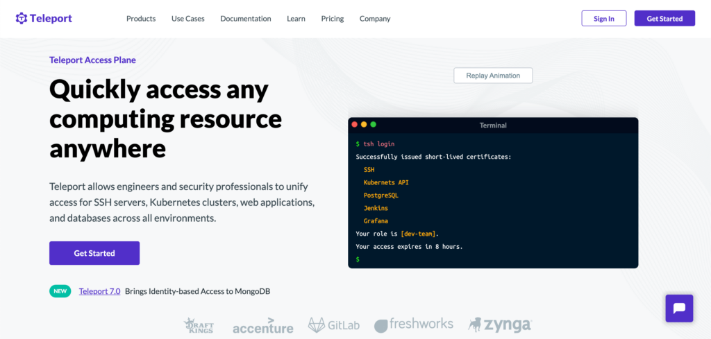
Here’s an example of a good user centric website by Teleport. I’ll limit the analysis to the homepage hero section.

What they’re doing right:
- Super clear hero copy – we immediately can tell what Teleport does, who it’s for and what problems it solves.
- Product UI example – web users like to see animated product UI so that they can conceptually see how the product works.
- Get Started CTA – you can get started right away with a 14 day free trial or you can talk to sales about enterprise pricing.
- Product update callout – right below the “Get Started” CTA you’ll see a subtle announcement of the latest product integration. Users like to see that you’re working on ways to integrate software into other systems.
Customer centric websites like Teleport provide transparency into the product. They want you to experience it and then talk to sales. It’s a great product led approach. Many enterprise SaaS companies prioritize pushing users into the sales process leading to a bloated pipeline of users who may not be a fit for the product.
SaaS companies are winning by using customer centric tactics on their website like Teleport does. Brochure websites hide information about the product leading to natural skepticism about the product.


