Resources
Arizona State University
Creating an interactive experience to educate on sustainability and the role it plays in our future

Services Performed
Research, UX/UI Design, Web Development, Ongoing Design + Development Support
Headquarters
Tempe, AZ
Years Active
2022
Industry
Nonprofit
The Client
The Rob and Melani Walton Sustainability Solutions Service at Arizona State University focuses on sustainability innovations locally and globally. The Sustainable Earth website is a Wells Fargo grant initiative that brings readers sustainability information, news, and ideas. Its goal is to inspire people to live more sustainably every day.
The Challenge
Sustainability is a complex subject with many related subtopics. The Sustainable Earth team wanted to organize its articles, videos, and other content in an engaging way that showcased the interconnectivity of sustainability’s subtopics. The team of ASU staff and grad students we worked with had big ideas for how to bring these concepts to life.
The Solution
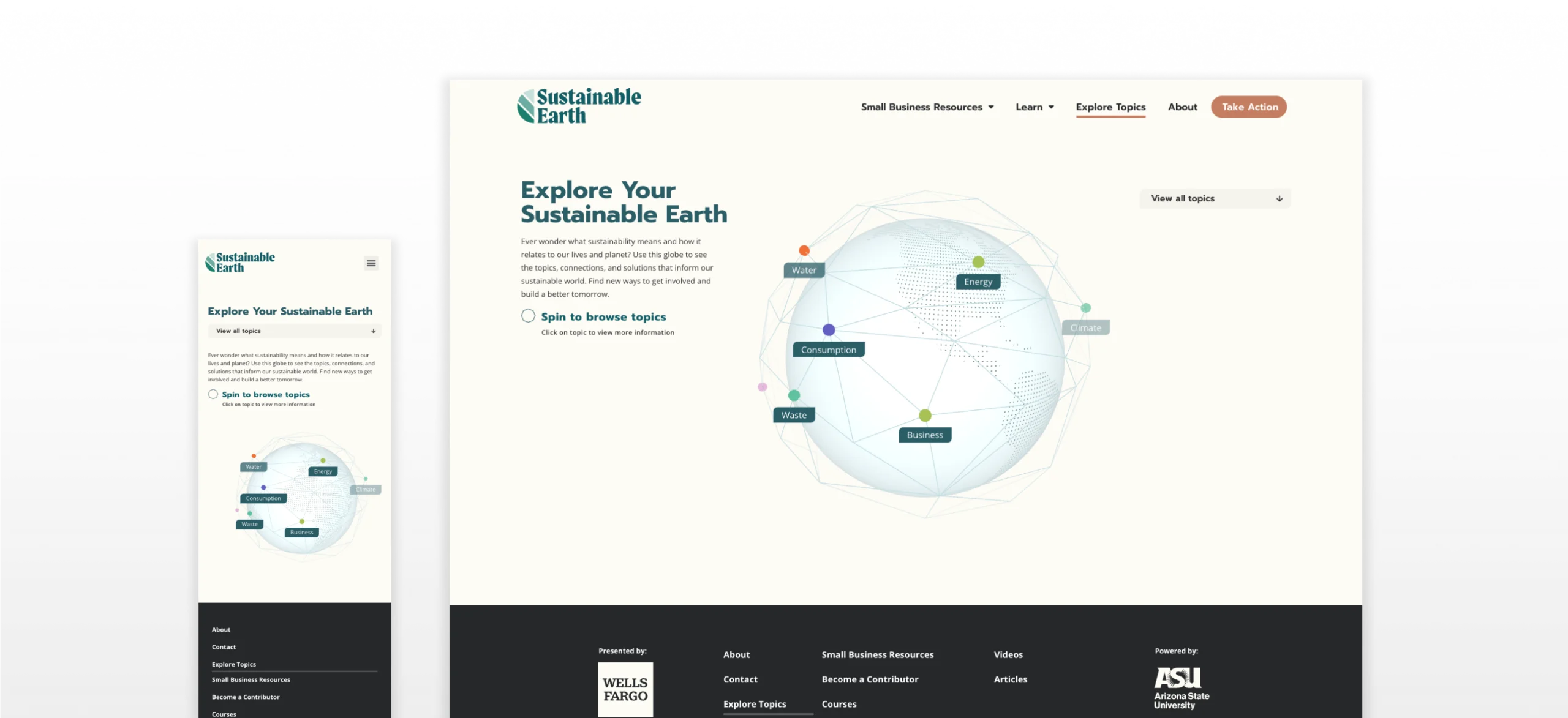
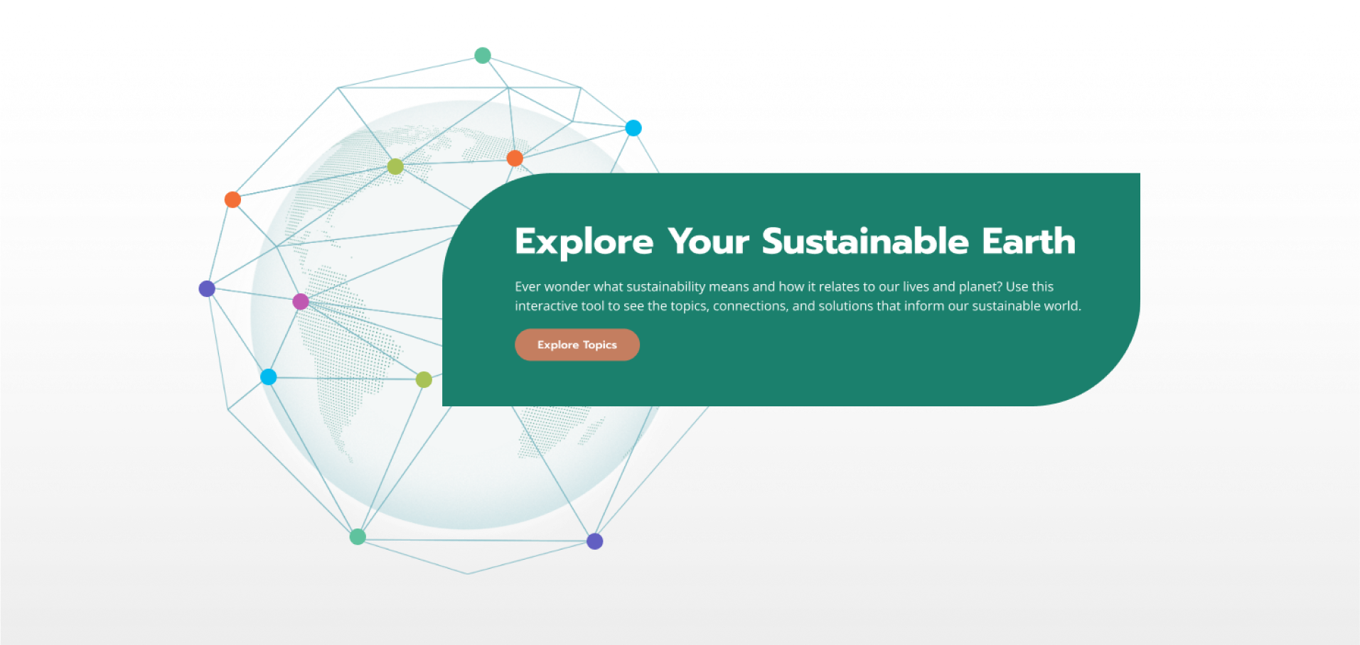
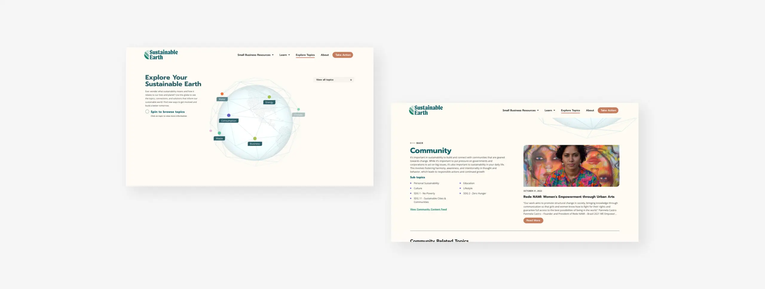
We relied on our design and development expertise to transform these complex concepts into a seamless, educational user experience. We created an interactive globe in place of a typical “search” feature on the Sustainable Earth resources hub. The globe highlights sustainability topics that, when clicked, lead to educational resources. Users have the ability to understand how topics relate to one another or dive deeper into a topic that interests them.

UX/UI Design
Collaboration between our designers, developers, and the Sustainable Earth team was key for this project. Our team developed a deep understanding of the story being told through this new feature, which led to strategic UX/UI recommendations. These recommendations allowed us to showcase the complexities of sustainability in a user-friendly way while pushing the creative envelope.

Color Palette Extension
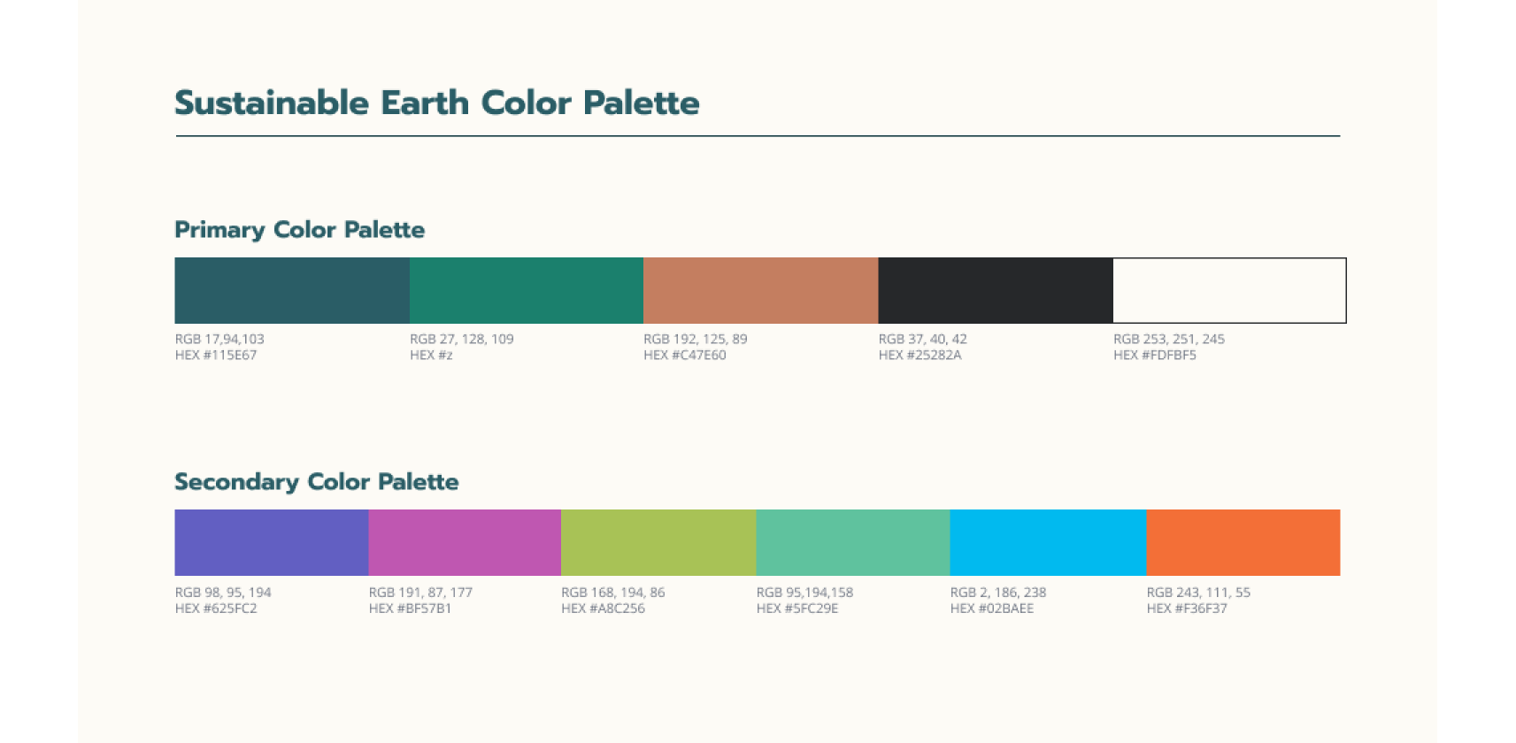
Since we were adding new features to an existing website for this project, we used the Sustainable Earth brand guidelines as the base for our design. These guidelines included a minimal, primary color palette consisting of five colors. We expanded that branding to include a secondary color palette for the interactive globe and related sections, an essential piece of this project’s design.
Not only did the secondary palette give the interactive globe a more playful feel, it served to differentiate topics from each other while the overall design shows their connectedness to sustainability. The end result was newly designed features that blend seamlessly into the existing website and encourage users to keep exploring.

Animation and Web Development
Our developers used three.js to create several 3D elements designed for user interaction. Knowing these interactive elements had to not only look great but perform well too, optimizations were made throughout the development process to ensure a good user experience on any modern browsers or devices.
Along with usability for website visitors, we wanted to create an easy-to-use WordPress experience for the Sustainable Earth team. We implemented a system that can be controlled, updated, and extended from the backend of the site. This allows the client to add, remove, update, and move components of the 3D rendering to update the globe without a developer.
We also created a drop-in plugin so the client can add this entire project’s functionality to other ASU websites with only minor customizations needed.