22 AI Websites for Design Inspiration in 2025
The AI industry is always at the cutting-edge of technology. As a artificial intelligence company, you need a website that reflects how powerful and transformative your AI tools are for customers. However, determining which design direction to go for your AI website can be challenging. Your website is your online storefront and it needs to be visually appealing while also functioning seamlessly.
Incorporating fun AI elements can make your website more engaging and enjoyable for users, such as creating a fun website from a prompt or utilizing AI for generating draft copies and content.
To help you navigate this crucial aspect of your business, we’ve put together 22 of our favorite AI websites in 2025 that offer inspiration for demonstrating design components, branding, and content architecture in an innovative fashion. These AI websites showcase the latest trends in web design and user experience while effectively communicating the benefits of complex AI tools in an engaging manner.
Before starting the design process, it is important to establish the website structure. Check out our blog on 10 Essentials Every B2B Website Should Have. Need guidance on how to take the next step from design to development? Motion Tactic is here to help. We build custom b2b websites – get in touch today to start your own!
Top Artificial Intelligence Websites for Design Inspiration
Whether you are looking to overhaul your existing site or create a new one from scratch, these examples provide a wealth of ideas to help you stand out in the competitive AI landscape.
Gorgias: Branded AI-Powered Customer Experience


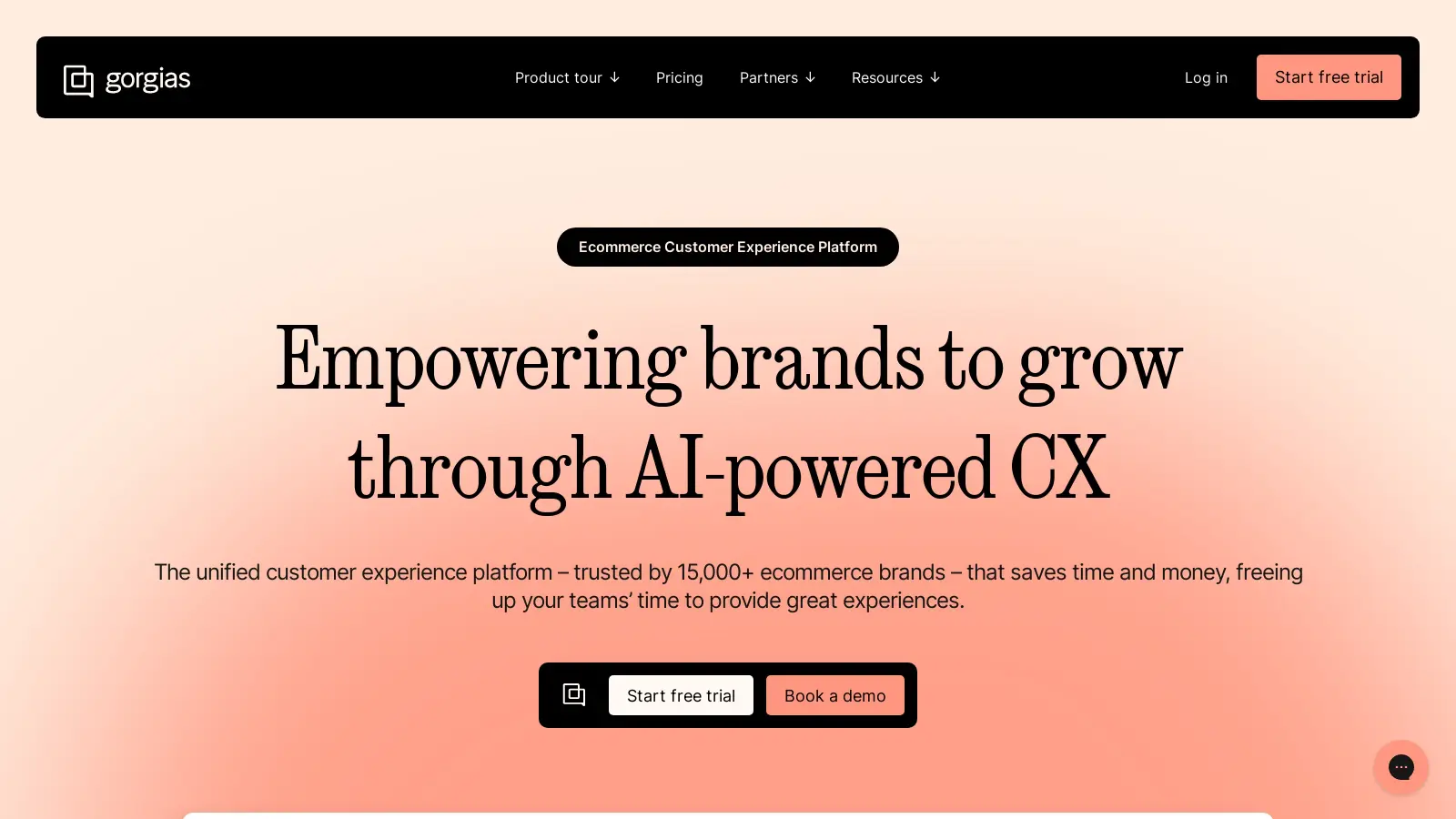
Gorgias offers an customer experience platform powered by AI for ecommerce clients. Their website has a fun, upbeat feel with a bright pink gradient background and pastel colors, prominent layered images demonstrating the product, and large colorful client photos paired with testimonials. Gorgias uses a sophisticated Serif font for headings, paired with a clean Sans Serif typography for paragraphs.
The website has an interactive pricing page where potential customers can enter in how many support tickets they have, the level of automation they want, and additional add-ons. Gorgias creates a recommended plan. The website prompts the user to start a free trial or book a demo. The pricing page also makes fantastic use of an FAQ content section below which always helps with SEO.
Writer: Full-Stack Generative AI
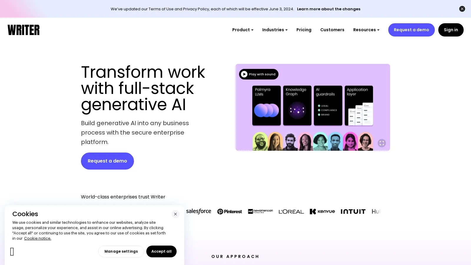
Writer helps organizations build secure AI driven workflows. The website has a tech forward feel with bright neons, people-focused imagery, and rounded corners and buttons on design elements. Writer uses interactive interface elements like a tabbed content section on the homepage which rotates through different use cases paired with simple animations that demonstrate the platform’s capabilities.
If you are looking for colorful custom icons, Writer is a great example – find them in the mega menus and the product pages.
Colossyan: AI Video for Workplace Learning
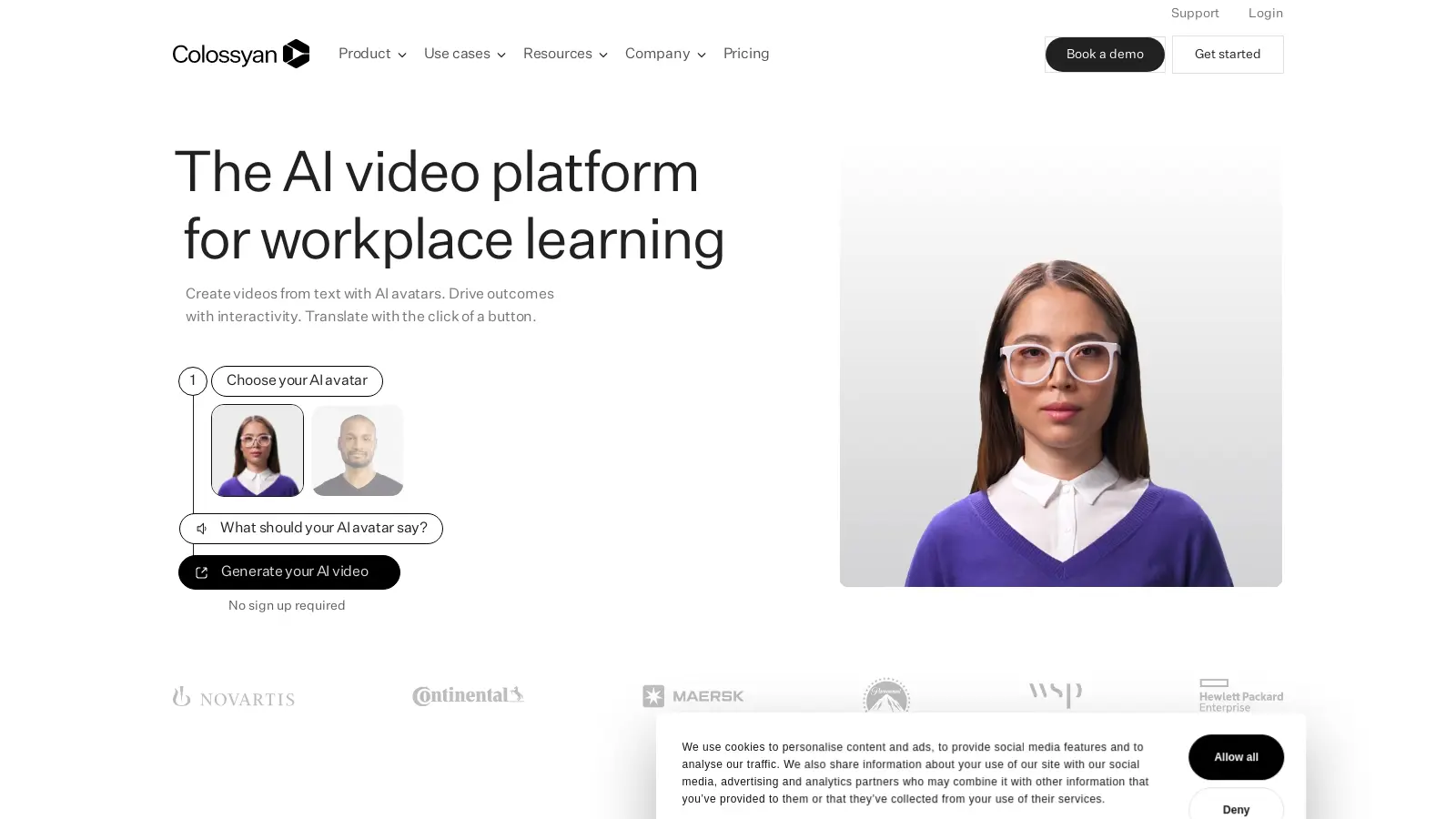
With a light and bright professional feel, the Colossyan website clearly shows potential customers how its product can create engaging AI videos with avatars from text. Colossyan can also generate AI audio files to complement its video content. The header immediately prompts site visitors to try out the product – no trial necessary.
We also love how Colossyan structured its Resources page. They have a clickable filter on the left side, and use simple rounded cards with professional, people-focused images in a 3 across format. They also highlight specific resources by making some cards full screen.
Scale: Leveraging Enterprise Data for Generative AI
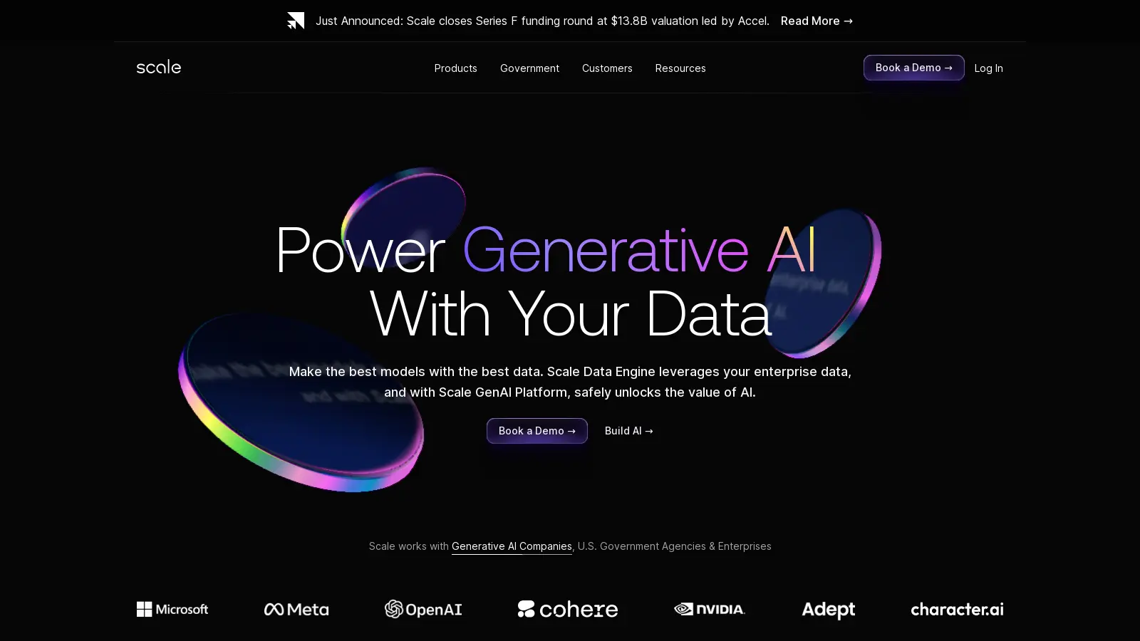
Scale helps government and tech clients build models with AI. The website has a dark theme with simple animations showing how the platform labels different types of data.
We love the animated model of the Scale data engine on the homepage. The model is divided into three different animated components that correspond to tabbed content on the left hand side. This brings in some dynamic movement while explaining the model in an engaging way!
Cohere: Generative AI and Advanced Retrieval
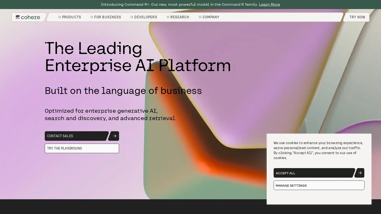
Cohere uses Generative AI to build models that work with applications requiring RAG. The brand is conveyed through abstract graphics moving throughout the background of the website and pastel colors for call out sections and CTA buttons. Content is layered onto glass effect containers with simple product animations.
The navigation bar is clear and simple and floats above the dynamic background. Overall this website has a soft, calming feel but is still very tech-forward.
Jasper: Marketing Revolutionized by AI
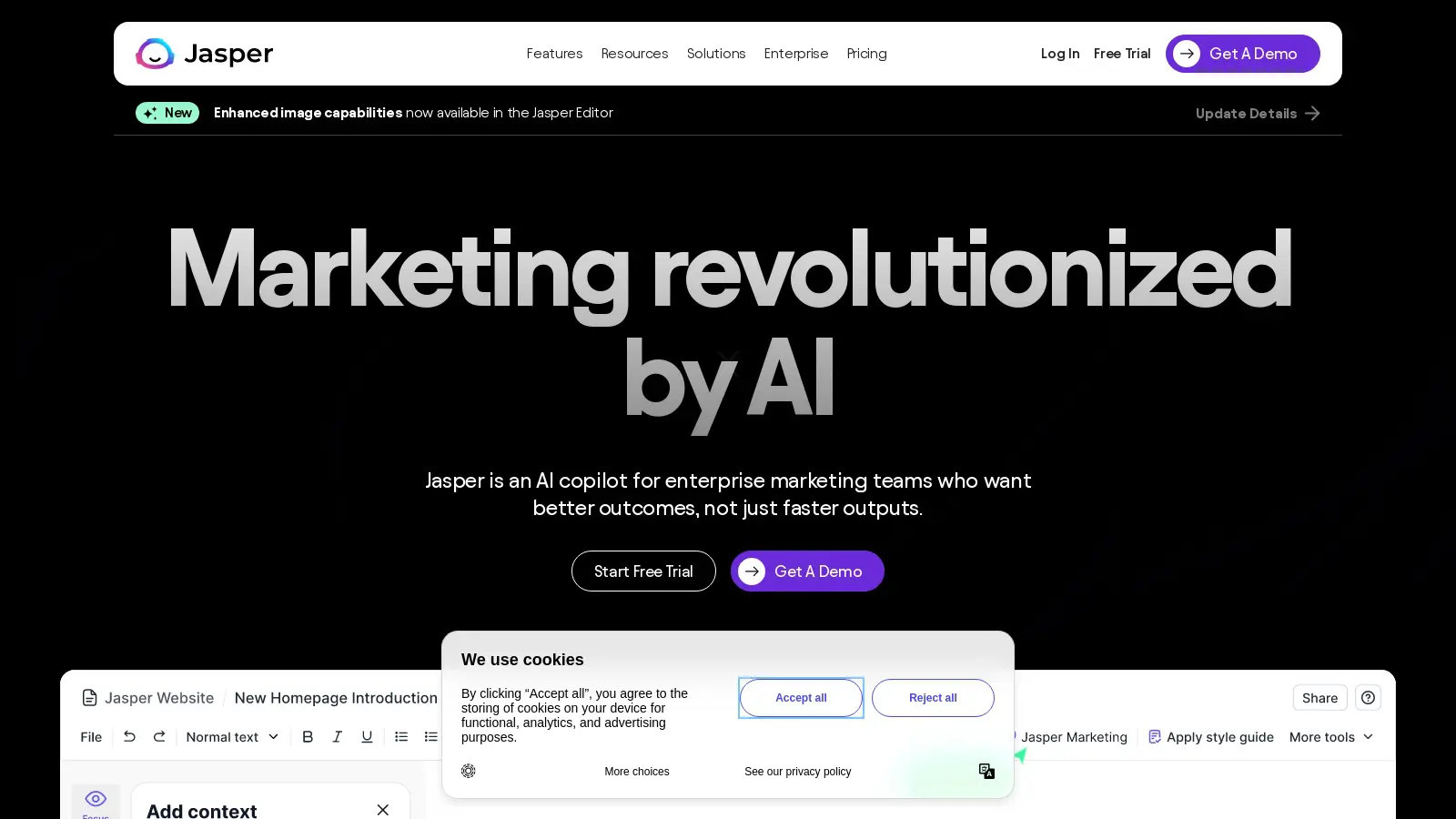
Jasper offers businesses an solutions for AI art and AI generated content for their marketing needs. Jasper also excels in AI image generation, creating marketing visuals that enhance digital campaigns. The website uses color blocking, full-width imagery, and simple custom line graphics to demonstrate AI features in the platform.
The website is clean and simple but still feels fun with muted colors. At the bottom of the homepage, there is an eye-catching full-width CTA section with a background that features social posts generated by the Jasper platform for different clients. The website also has comprehensive, clearly organized mega menus customized for each page with featured pages and custom icons.
Pinecone: Bringing AI Applications to Market
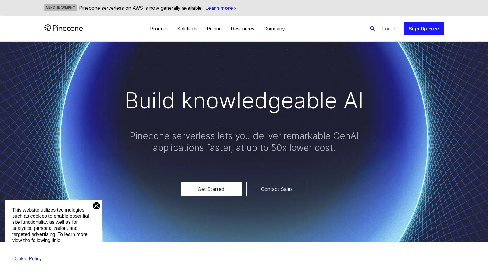
Pinecone is a vector database that enables enterprise customers to create AI tools. The website is sparse but direct with ample white space and dark content containers for informational graphics. Simple line graphics and icons and thin typefaces contribute to the professional feel of the site.
We love the Customers page where Pinecone uses a mix of different card sizes and layouts to highlight certain customer success stories and testimonials with pull quotes. This is a clean but engaging customer testimonials section that could serve as fantastic inspiration for your AI website design.
Otter.ai: AI Meeting Notes
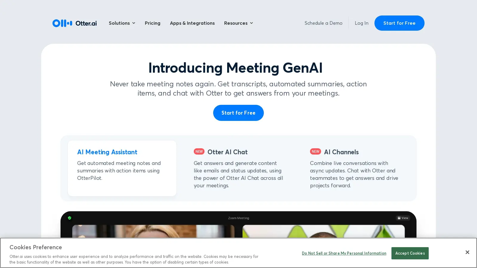
Otter.ai makes meetings easy by generating text, summaries, action items, and transcripts for business clients. Its website is simple but makes immediate impact with an animated full-width product demo on the homepage. Otter.ai clearly communicates key features with a three step process complimented by rounded content cards and colorful icons.
If you need inspiration on how to display pricing models, the website boasts user friendly comparison between the free version and paid plans. This is also a great example of using direct CTAs to guide visitors to a trial or paid plan.
HeyGen: AI Video for Content Marketing
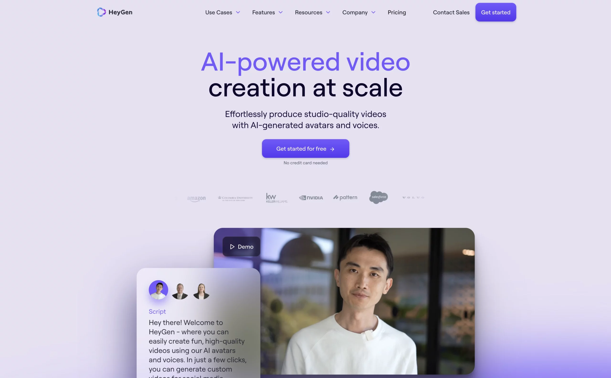
HeyGen uses AI to create highly customizable video for product marketing, learning and development, product demos, and content creation. The site uses large text headings and relies heavily on videos paired with animation to demonstrate the tool. The website uses bright colors and gradient backgrounds with a mix of different sized cards to demonstrate product features.
This website is a great example of video use to create an engaging website without animations or graphics. This keeps the focus on demonstrations of the product.
Weights & Biases: AI Developer Tool
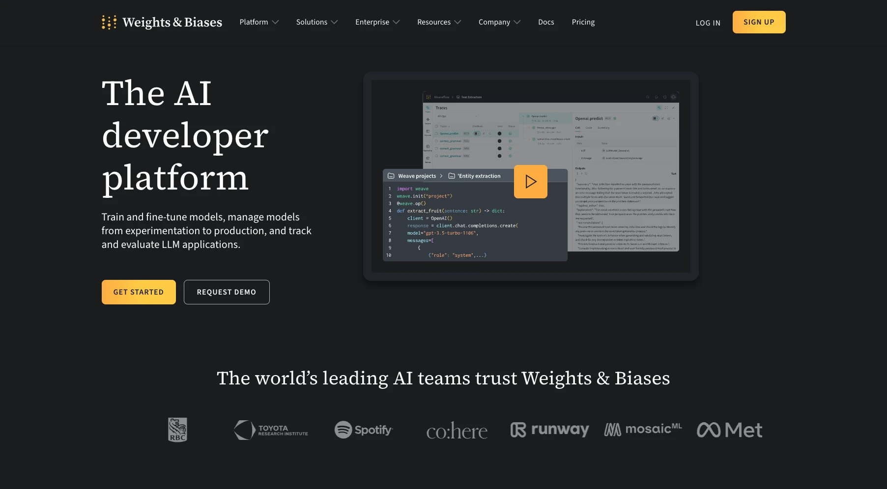
Weights & Biases makes it easy for developers to train and manage AI models and track and evaluate LLM applications. It can also be used as an AI-powered search engine for organizing and searching digital content. We love the homepage section which has a drop down where visitors can select what their role is too see how the tool can work for them. The graphics and copy change to demonstrate how the platform can provide value to the entire team.
The website is a great example of a comprehensive resources hub which they call Weights & Biases Docs. The hub has information for developers, troubleshooting guides, and tutorials. The hub has a different feel than the main website, with lighter background and pastel colors, but it still fits into the brand.
Anyword: AI Writing Tool for Marketing Teams
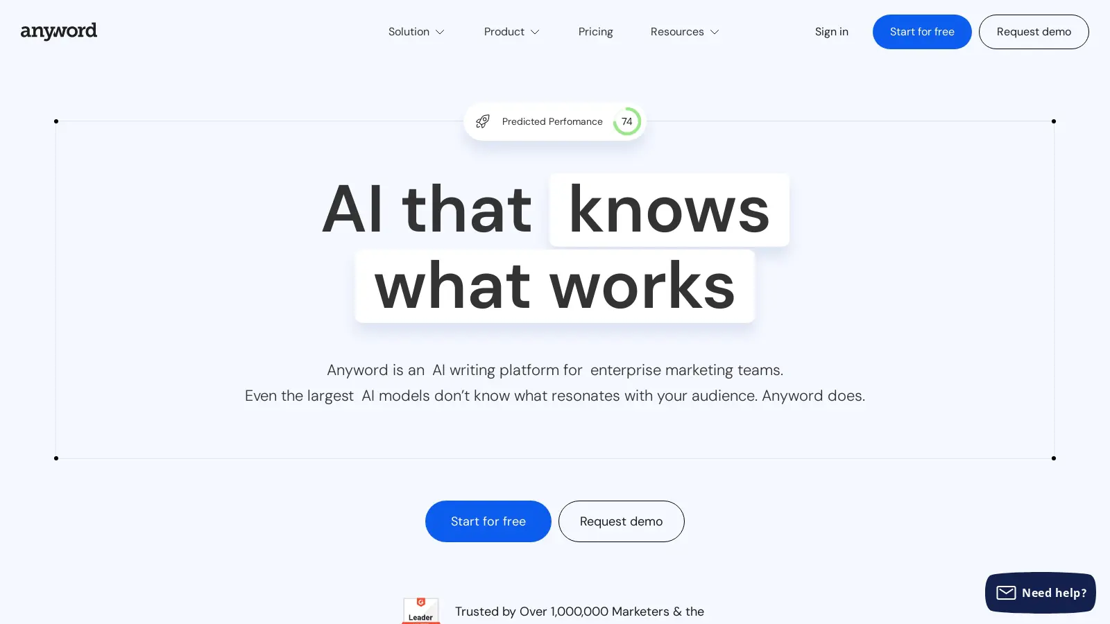
Anyword helps business create copy that drives results with performance prediction and the ability to boost target audience engagement while writing in the correct brand style. The website immediately demonstrates how the tool works with simple, colorful animations on its own hero copy. The homepage also features a tabbed content section where visitors can select their marketing needs and read how Anyword can work for the whole marketing team. Pairing these content sections with people-focused photography bring a human element to the design of the website.
Taskade: Workforce AI Partner for Productivity
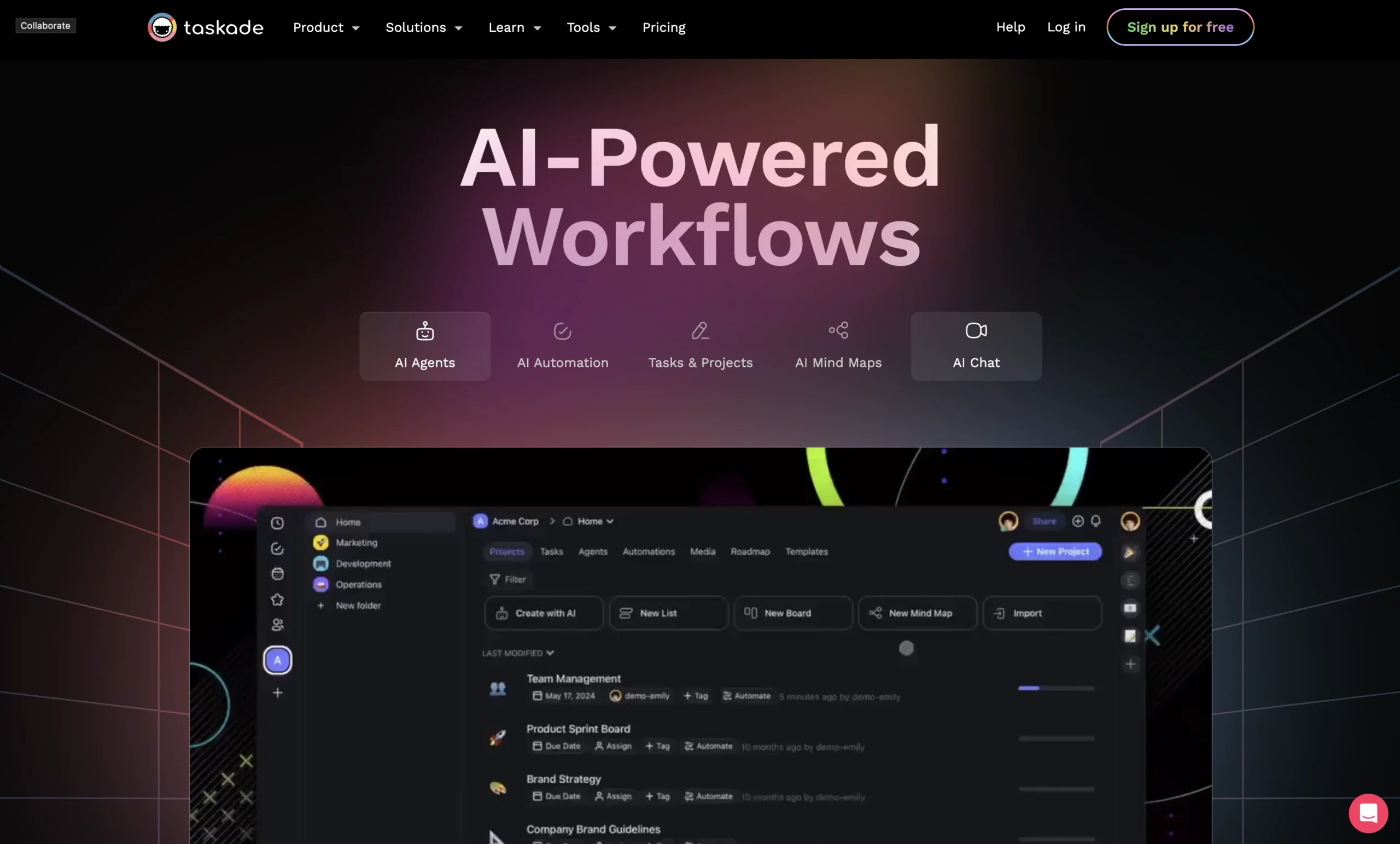
Taskade instantly gives the site visitor an idea of how its AI tool powers workplace automation with a full screen animation complimented by a tabbed section that highlights mind mapping, process automation, AI agents, and AI chat. The website design is tech-forward with bold Sans Serif fonts and dark gradient backgrounds layered with line graphics, and no photography – just bold product images and dynamic transitions. The homepage is a great example of how to integrate product animations into your site.
Anthropic: AI Research and Safety
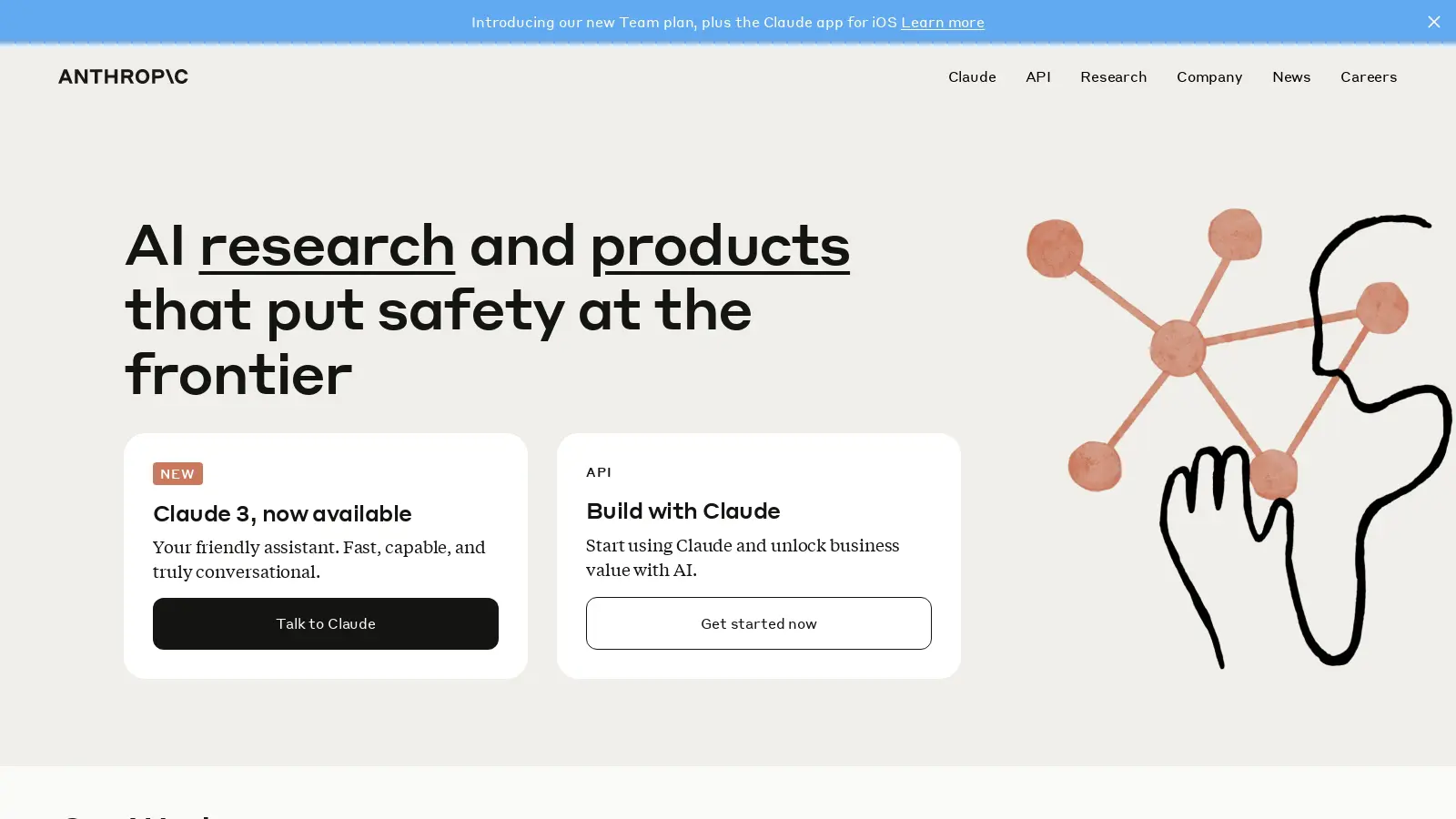
Anthropic is a research based AI company with a variety of tools to leverage ai technologies. The website is simple with a creative feel due to the friendly heading font choice paired with a more sophisticated Serif font for paragraphs, and simple graphics that look like watercolor illustrations. The site also adds visual interest through dynamic transitions in the headers and calm colors for different card styles.
On secondary pages through out the site, the design also makes use of colorful, people-focused photography, like on the Careers page. This brings a human element to the design of the site. If you are looking for a design direction for your AI website that differs from the standard tech feel. Anthropic is a great one to check out!
ZenML: Standardize MLOps
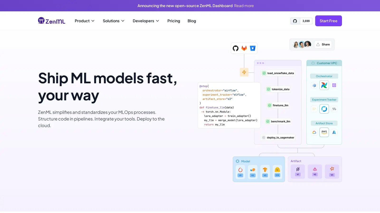
With light and fun feel, ZenML clearly illustrates complicated machine learning concepts through bright graphics with icons and pastel colors in a flat design. This website also has a creative feel and uses fresh UX design to keep site visitors scrolling and engaged.
At the bottom of the homepage, we love how ZenML lays out the Python code for customers to quickly learn how to plugin the correct code. This section features buttons on the left hand side that highlight specific code in the following graphic when the visitor hovers. Overall, this website has a fresh, upbeat feel to it that explains AI concepts clearly with fun graphics that are utilized all throughout the site. This website is also has a fantastic example of a tutorial page that takes visitors throughout the platform.
OpenAI: ChatGPT for Desktop

OpenAI’s website is abstract, with pastel AI art used on all content cards, and minimalist, in the font choices, white space, and muted gray background. The website uses tabbed content sections with simple line charts and muted colors to demonstrate how ChatGPT can customize workflow process for all types of teams. The website makes frequent use of simple quotes for testimonials through out.
Overall, this website knows it has name recognition and doesn’t use any fancy UX design to catch visitors attention. Instead, the pages are almost sparse, with just the right amount of text to let the reader get the information they need without distraction. The website’s visual appeal comes from the AI generated art that creates a striking impact.
BentoML: Platform for Building Fast & Secure AI Apps
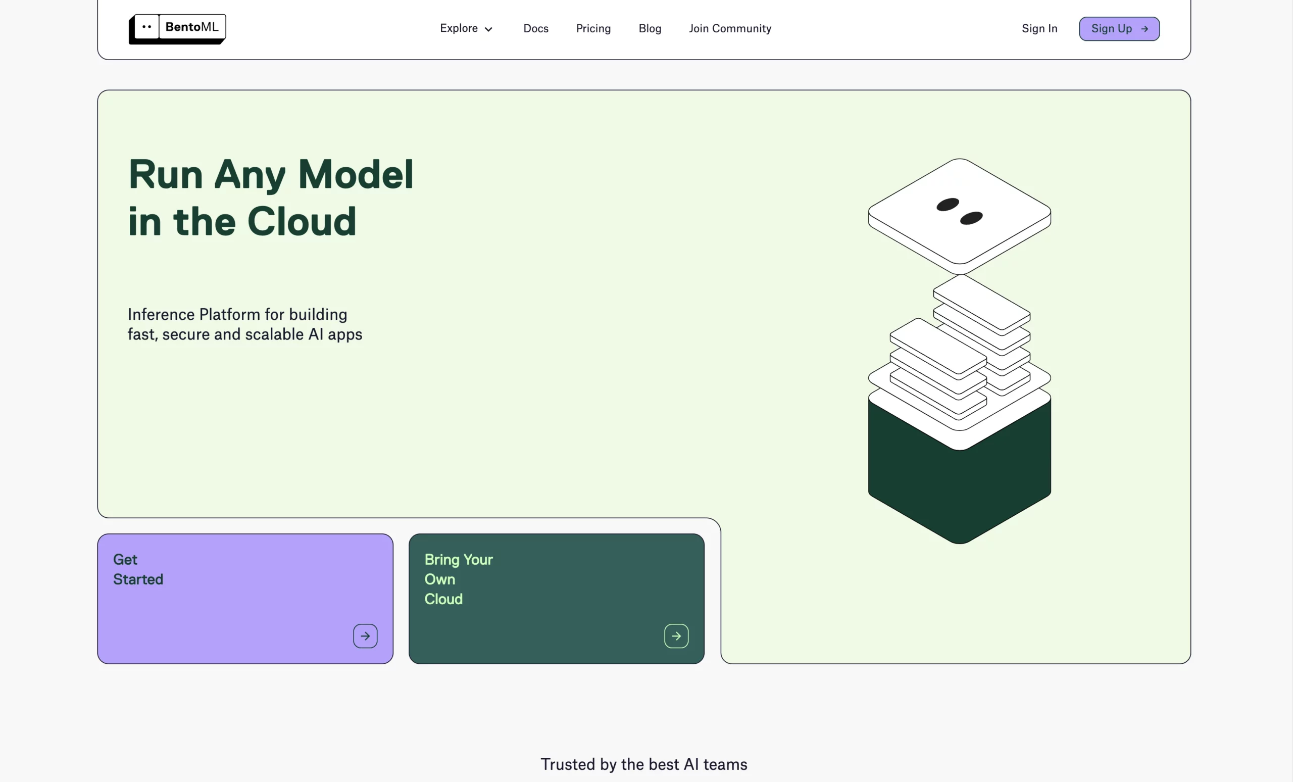
BentoML utilizes a flat website design with thin lines, rounded corners, pastel colors, and animated graphics. The website design is dynamic yet simple and understated. We love the use of custom, animated graphics alongside the code used to create AI API service for different software.
Bento also has a clean example of pricing comparison tables on the pricing page if you are looking for minimalist inspiration for your own site.
Play: AI Voice Generator
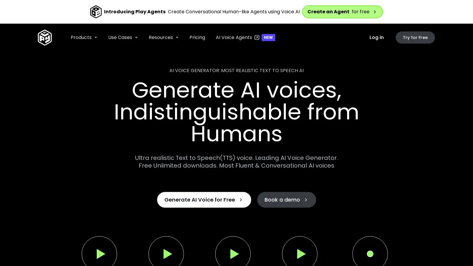
Play offers customers an AI tool that generates expressive speech, AI voice cloning, and voice generation AI. The website is primarily black and green, with light grey sections and simple, abstract green graphics to illustrate the types of content Play generates. The website lets you sample different types of voices and over 100 languages depending on your needs with simple play buttons.
At the bottom of the home page, Play’s website has an excellent example of an FAQ section to increase SEO results. The site also does a great job at directing visitors to try the free AI version or book a demo.
Endgame: Account Research Powered by AI
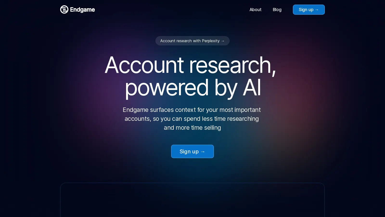
With a dark, high-contrast theme, Endgame brings a tech-forward feel to its site. The website uses glass effects to highlight bold typography and a variety of animated graphics that demonstrate the AI product’s features. This site is well designed but relatively simple. The blog also makes fantastic use of abstract AI generated art for the content cards, adding in some color to the page. If you are looking for a website with eye-catching design but not many pages, check out Endgame.
Predis: Social Media AI-Generated Content Creation
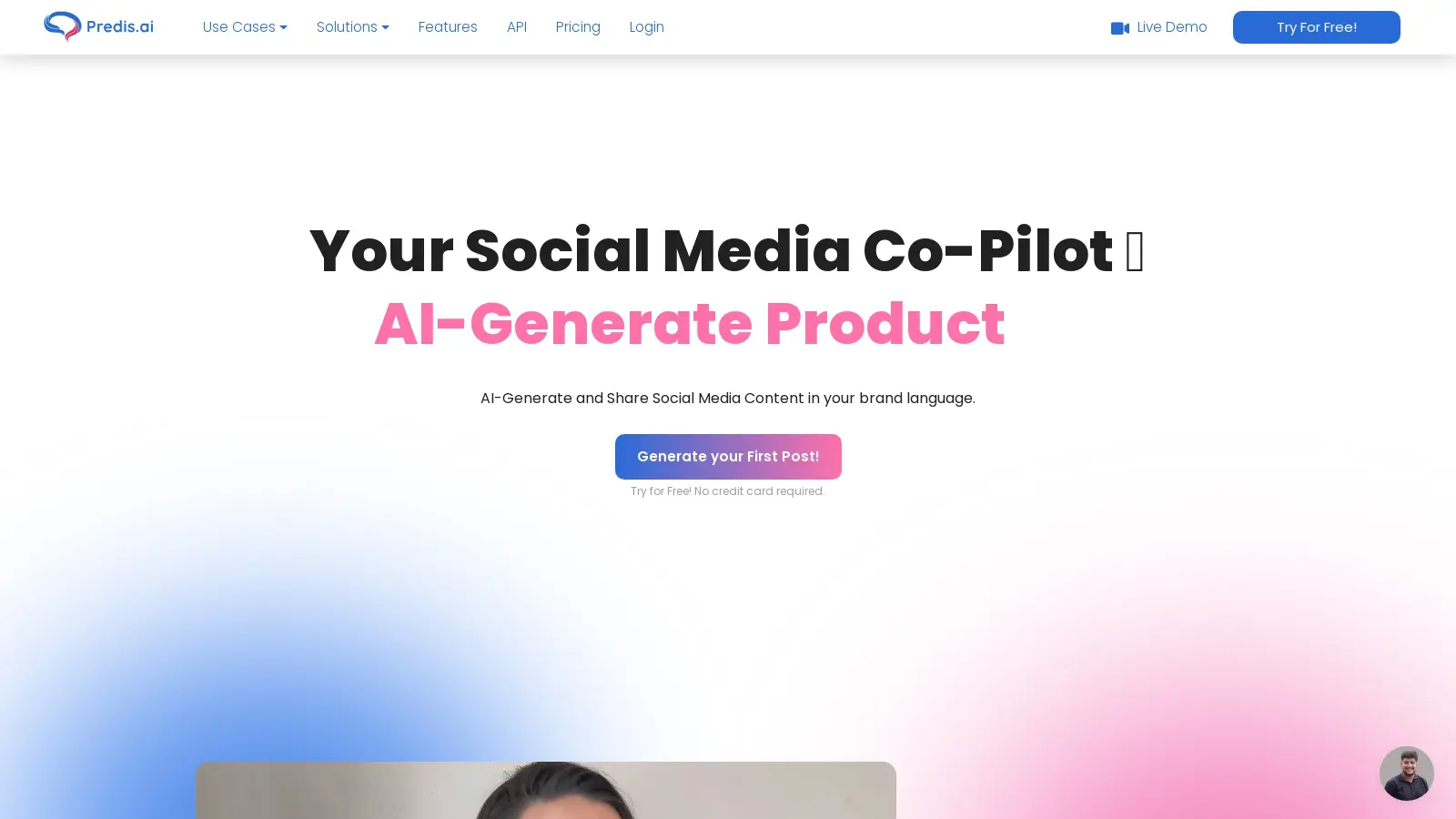
Predis is an AI tool that can generate images, music, product images, video and write captions for social media. The website introduces visitors to the product with a bold full screen hero with a heading that rotates between the different product use cases. The theme is light, bright, and airy with light pastel shapes in the background. Predis uses layered product images with examples of AI-generated content to demonstrate the AI tool.
The use cases pages neatly layout how the process works for generating different types of content with a vertical step-by-step guide with text and layered graphics, complimented by a CTA button at the bottom inviting users to try a free plan.
Mapendo: Aquire High-Quality Users with AI

Mapendo uses machine learning to find quality user bases for apps by generating app install campaigns. The website uses text and illustrated graphics of with people and shapes to illustrate machine learning concepts. The product pages do a fantastic job of illustrating the different aspects of the tool by using animated cards with graphics and text that overlap one another as the visitor scrolls. This is a great example of demonstrating product features without images taken directly from the software.
Tare
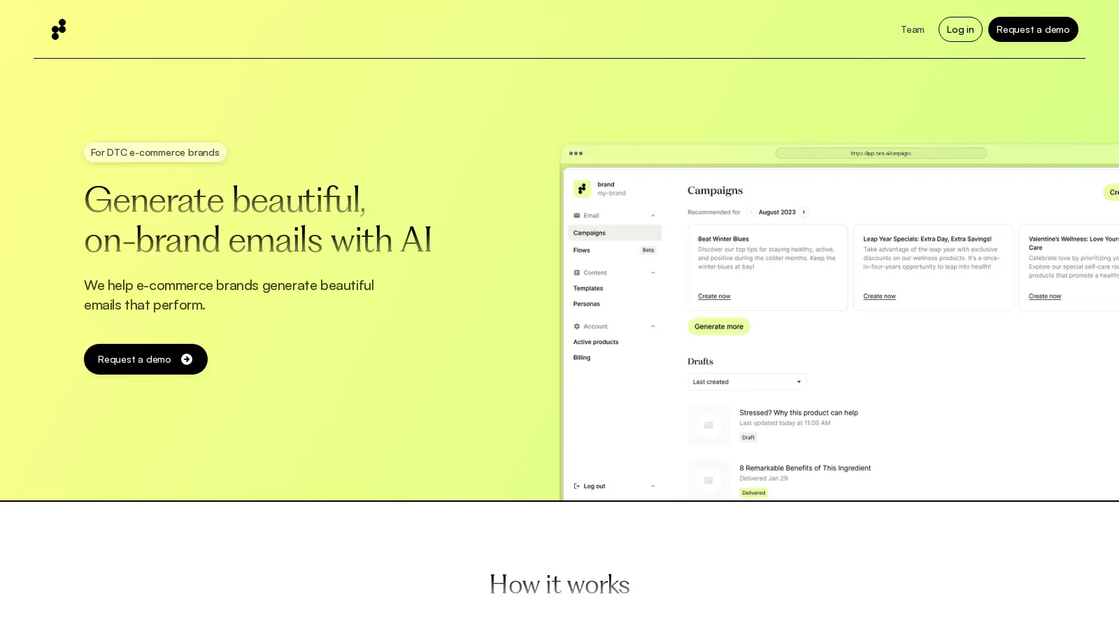
Tare’s website is striking with a bold neon yellow as its main accent color and a sophisticated Serif text for heading. The website feels minimalist and modern with ample white space. Tare also has appealing product explaining content cards with product images and simple text explanations. Further down the homepage, Tare has a clean, tabbed content section to demonstrate different method of email optimization through the tool. We love the scrolling section that shows examples of branded emails made with Tare.
Flockjay: Sales Enablement with AI Tools
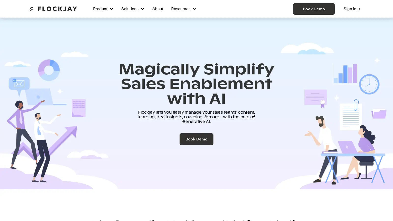
We love how Flockjay instantly gives site visitors a taste of the product with a full screen personalized dashboard image. The use of colorful content cards reminiscent of Post-It colors with simple icons bring a fun-feel to the site while still maintaining an approachable but professional theme. This site is also another example of one that uses layered graphics but does so by mixing people illustrations with product images.
If you are looking for a footer example, Flockjay’s footer is organized into multiple links to different use cases for sales teams, allowing site visitors to easily find more information on the solution they need.