The fintech world has exploded in recent years, revolutionizing how we manage money. Financial institutions are embracing cutting-edge technology, and consumers are demanding user-friendly and visually appealing experiences from the best fintech websites. A successful fintech website is more than just a digital storefront; it’s a crucial tool for attracting new users, building trust, and driving customer satisfaction.
This article will explore 10 top fintech websites that exemplify best fintech website designs, highlighting their design excellence and user-friendly features. We’ll delve into the key elements that make them stand out, from modern design and intuitive navigation to interactive elements and bold typography.
What is Financial Technology?
Financial technology, or fintech, refers to the use of technology to improve and automate financial services. Financial management is a crucial aspect of fintech, highlighting its importance in providing effective solutions for managing finances. This encompasses a wide range of innovations, including digital banking, investing platforms, lending services, insurance technology, and payment processing. Fintech leverages technologies such as artificial intelligence, blockchain, and big data to provide more efficient, accessible, and personalized financial services to individuals and businesses.
The Rise of Fintech and its Impact on Financial Institutions
The rise of fintech has significantly impacted traditional financial institutions such as banks and insurance companies. Fintech companies are disrupting the market by offering innovative and often more affordable services, challenging the established order.
- Increased Competition: Fintech companies are introducing new and innovative products and services, forcing traditional institutions to adapt and compete.
- Enhanced Customer Experience: Fintech companies prioritize customer experience, offering user-friendly interfaces, personalized services, and 24/7 accessibility.
- Technological Advancements: Fintech companies are driving the adoption of new technologies within the financial industry, such as blockchain and artificial intelligence.
For example, in the realm of car insurance, fintech companies are leveraging modern technology to create seamless and user-friendly experiences, simplifying the purchasing process and appealing to tech-savvy consumers.
What Makes a Great Fintech Website
A great fintech website is one that effectively combines cutting-edge technology with user-friendly design to provide a seamless and engaging experience for customers. Fintech websites play a crucial role in shaping the financial industry, and a well-designed website can make all the difference in attracting and retaining customers.
The Importance of Fintech Website Design
In the competitive fintech landscape, effective web design is crucial for success. A strong fintech website design serves several key functions:
- Attracting and Engaging Customers: A visually appealing and user-friendly website is essential for attracting and engaging new customers.
- Building Trust and Credibility: A professional and secure website builds trust with potential customers, demonstrating a commitment to security and transparency.
- Driving Customer Acquisition: A well-designed website can effectively communicate the value proposition of a fintech company and drive conversions, such as account sign-ups or product purchases.
- Enhancing Customer Experience: A user-friendly website with intuitive navigation and easy-to-find information enhances the customer experience, increasing customer satisfaction and loyalty.
Key Principles of Fintech Website Design
When it comes to designing a fintech website, there are several key principles to keep in mind. These include:
- User-Centric Design: A great fintech website should be designed with the user in mind. This means creating a website that is easy to navigate, visually appealing, and provides a seamless user experience.
- Cutting-Edge Technology: Fintech websites should incorporate the latest technology to provide a secure, fast, and efficient experience for customers.
- Personal Finance Management: A great fintech website should provide customers with the tools and resources they need to manage their finances effectively.
- Interactive Elements: Interactive elements such as animations, videos, and infographics can help to engage customers and make the website more enjoyable to use.
- Customer Satisfaction: A great fintech website should prioritize customer satisfaction, providing customers with a positive experience that meets their needs and exceeds their expectations.
Investing Made Easy
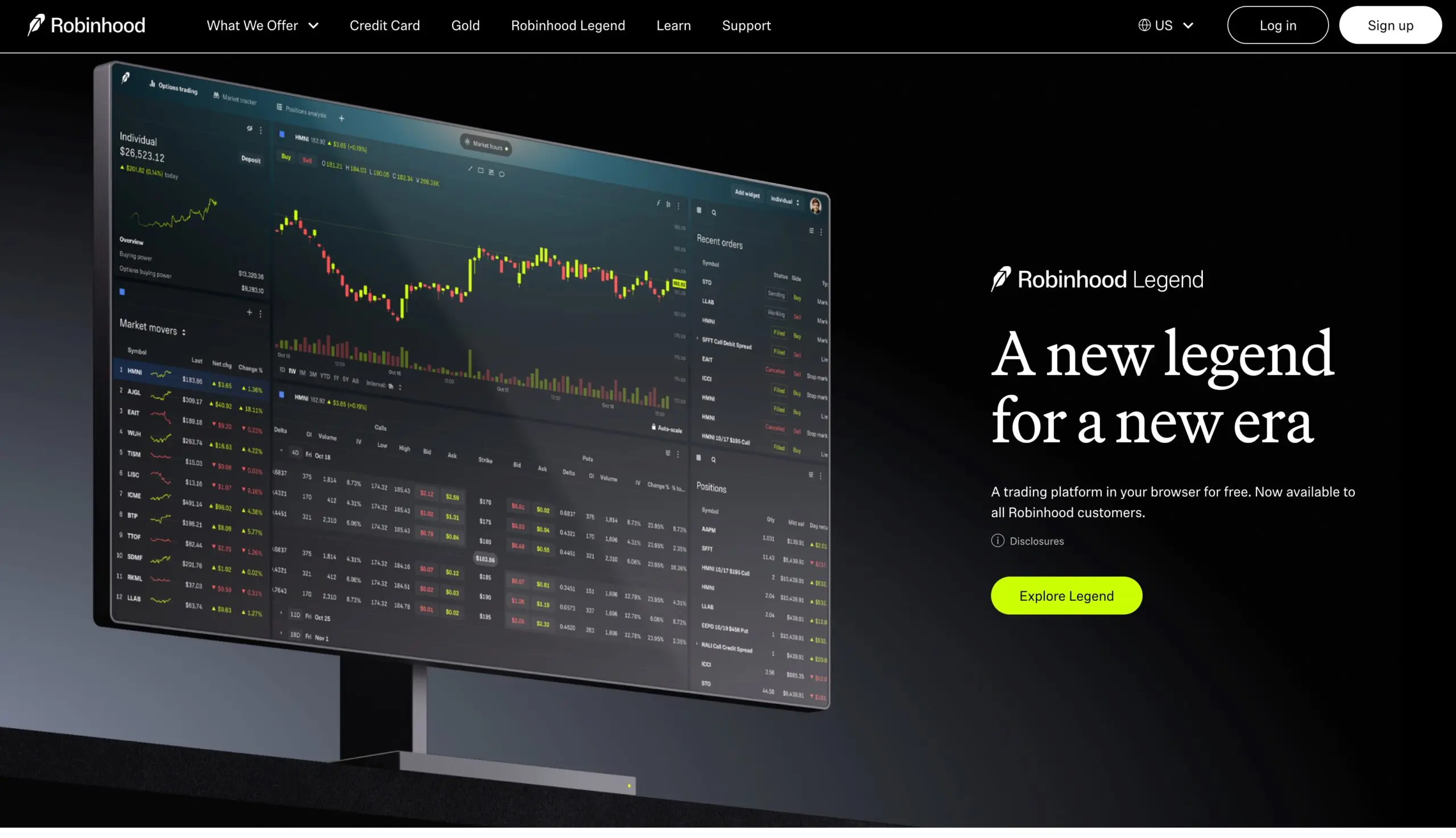
- Robinhood: This great example of a fintech website has gained immense popularity by making investing accessible to everyone. Their clean layout and user-friendly interface, combined with gamification elements, have attracted a massive user base. Key design highlights include:
- Minimalistic and Intuitive Interface: Robinhood prioritizes simplicity, making it easy for both seasoned investors and new users to navigate the platform.
- Focus on Mobile: The mobile-first approach ensures a seamless experience for users on the go.
- Data Visualization: Interactive charts and graphs present complex financial data in an engaging and easy-to-understand manner.
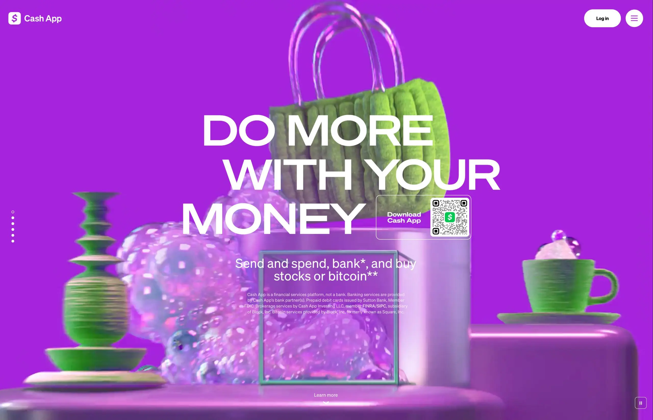
- Cash App: This highly engaging financial technology platform combines visually appealing design with user-friendly functionality. Its colorful graphics, ease of navigation, and multi-functional capabilities cater to users looking for seamless money management, investment options, and overall convenience.
- Visually Appealing and Engaging: The app utilizes a vibrant color palette and engaging animations to create a visually appealing and enjoyable user experience.
- Personalized Experience: Cash App offers personalized features, such as custom card designs and personalized spending insights, to enhance user engagement.
- Focus on User-Friendliness: The app prioritizes user experience with features like easy onboarding, simple transaction processes, and clear instructions.
Personal Finance Management Simplified
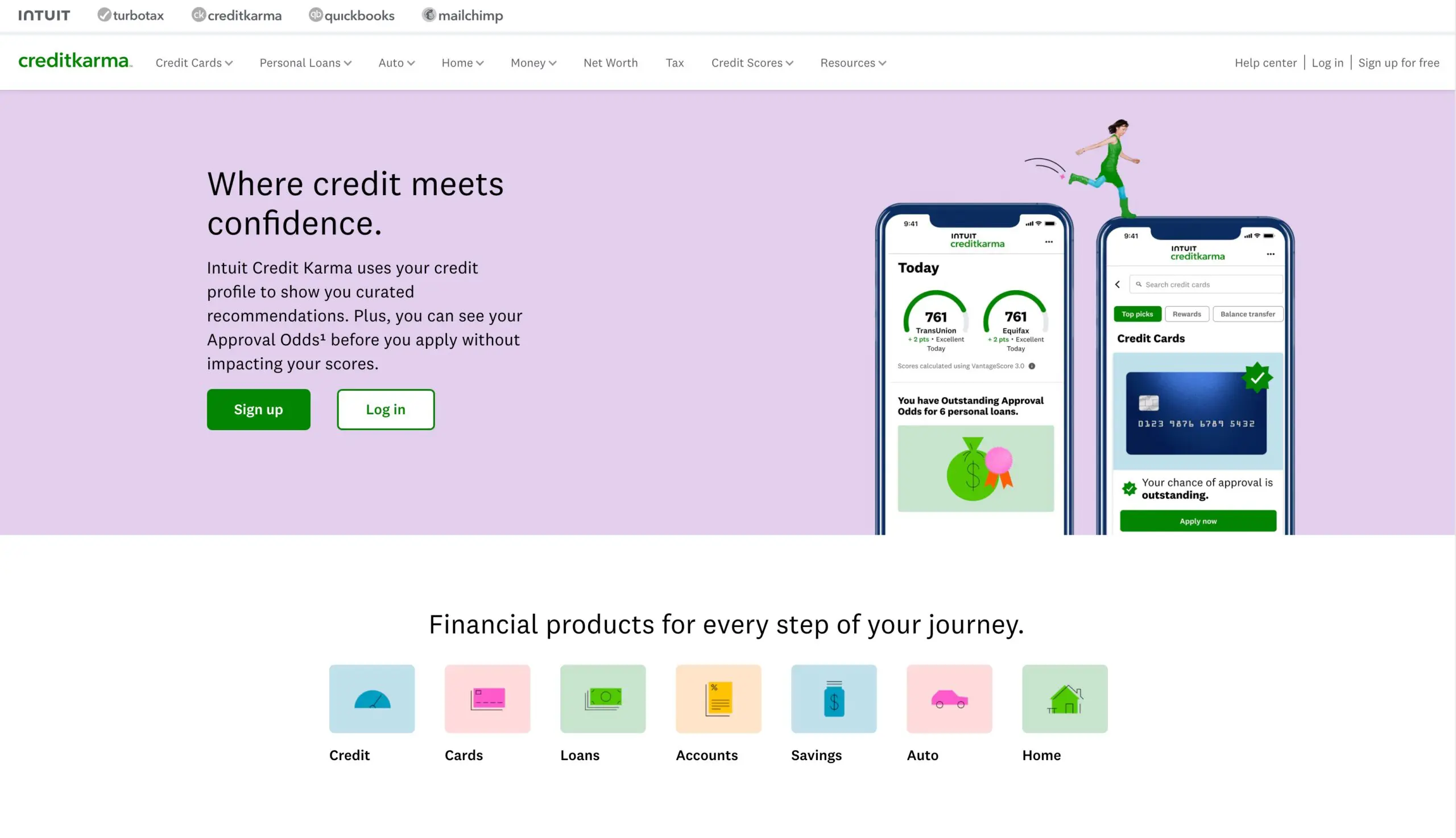
- Credit Karma: This successful fintech platform provides users with free credit scores and reports, empowering them to take control of their financial health.
- Focus on user flow: When you arrive at the “Help” page, there are two jumping off points that will suit almost any visitor. For the user who wants to be specific, they can use a search tool. For more common issues, such as member login or account information, Credit Karma provides shortcut links to each.
- Clear value proposition: The headline ‘Your Credit Score Should Be Free – and Now It Is’ clearly states their core benefit: providing free credit scores. This resonates with users who may have felt unfairly charged for this information in the past. The headline’s tone is empowering and positions Credit Karma as an advocate for consumers.
- Interactive Tools: The website offers a range of interactive tools, such as loan calculators and debt payoff planners, to help users make informed financial decisions.
- User-Friendly Dashboard: The dashboard provides a centralized view of all relevant financial information, making it easy to track progress and identify areas for improvement.
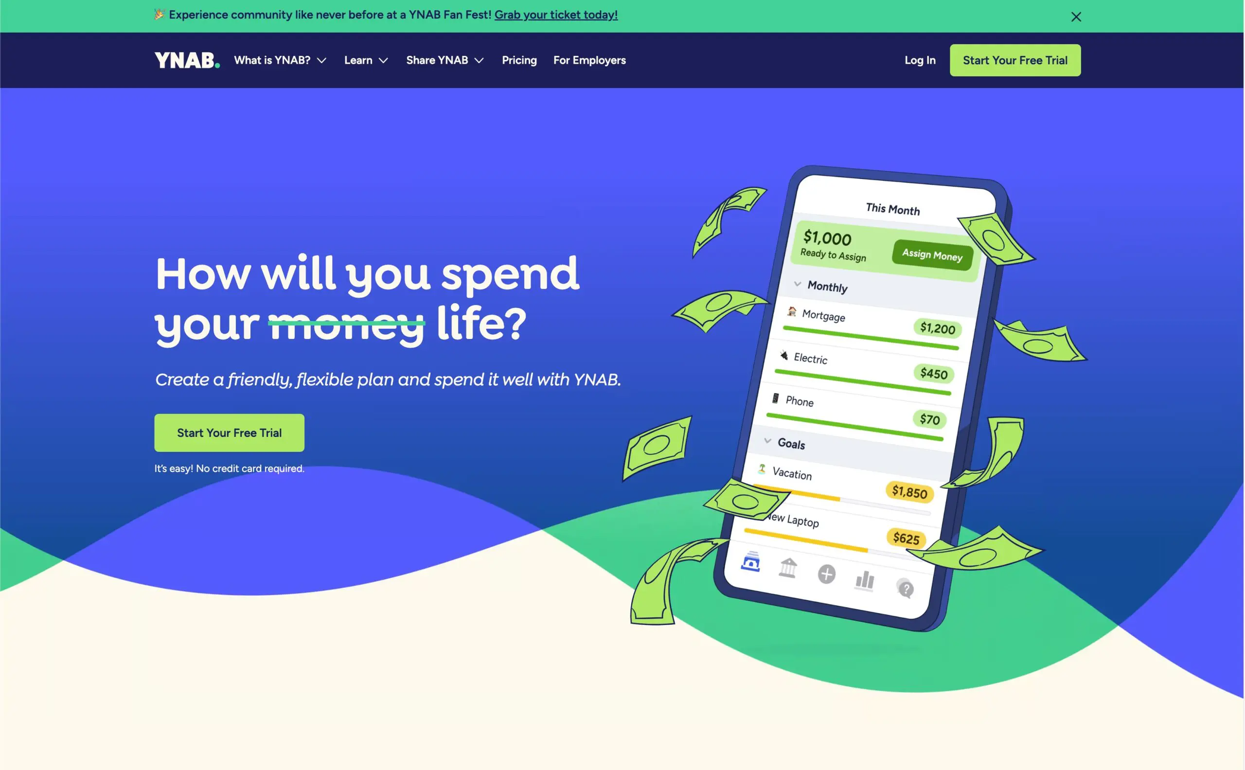
- YNAB (You Need A Budget): This platform offers a unique approach to budgeting, emphasizing conscious spending and financial freedom.
- Intuitive Interface: The website is designed with a focus on simplicity and ease of use, making it accessible to users of all technical abilities.
- Use of a distinct color palette: YNAB uses a distinct color palette that they call “Blurple” which they say reflects the feeling of users who are empowered by YNAB to take control of their finances.
- Focus on user stories: YNAB’s website puts a focus on showcasing user stories and testimonials. This can help visitors connect with the product on an emotional level and see how it can benefit them.
Insurance Reimagined
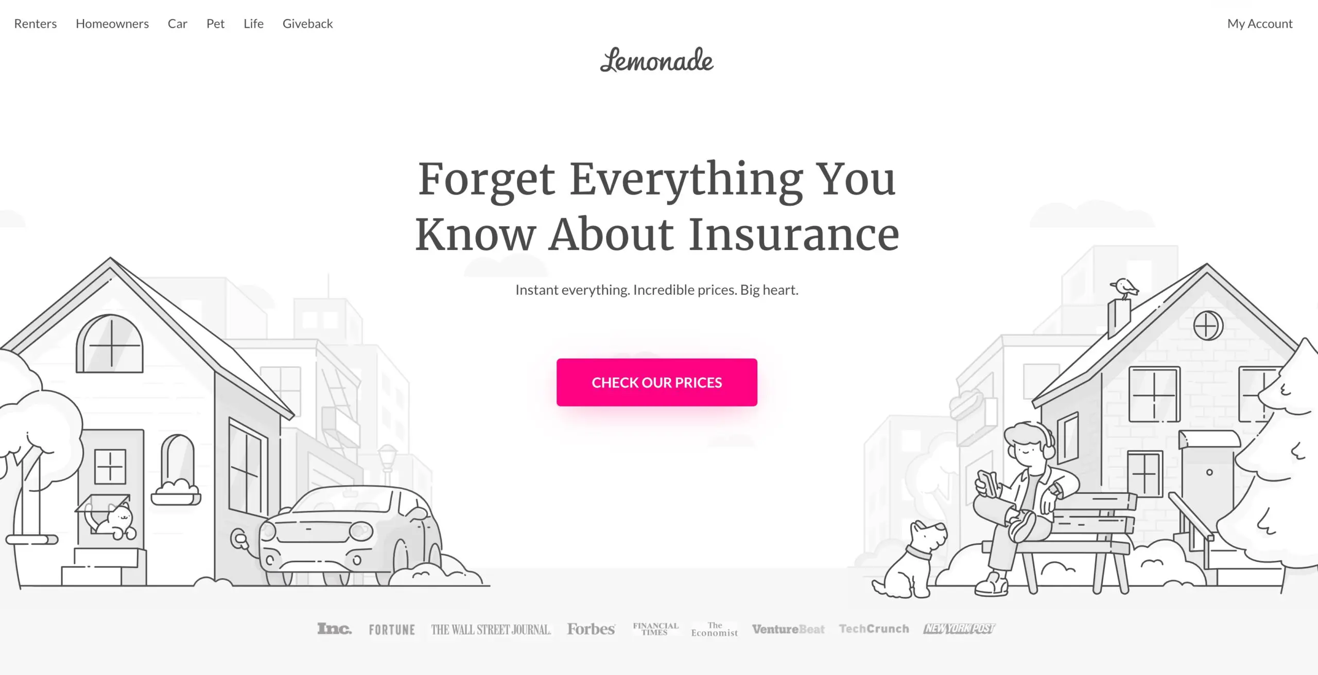
- Lemonade: This innovative insurance provider leverages technology to streamline the insurance process.
- Streamlined User Interface with AI Integration: Lemonade employs a minimalist design that guides users through the insurance process seamlessly. The integration of their AI bot, Maya, facilitates quick and efficient policy customization, making the experience intuitive and user-friendly.
- Transparent Pricing with Visual Appeal: The site prominently displays starting prices for various insurance products, such as renters, homeowners, car, pet, and term life insurance. This transparency, combined with appealing visuals and concise descriptions, helps users make informed decisions effortlessly.
- Social Proof through Customer Testimonials: Lemonade features real-time customer testimonials and social media mentions, showcasing positive experiences. This dynamic display builds trust and credibility, reinforcing the company’s commitment to customer satisfaction.
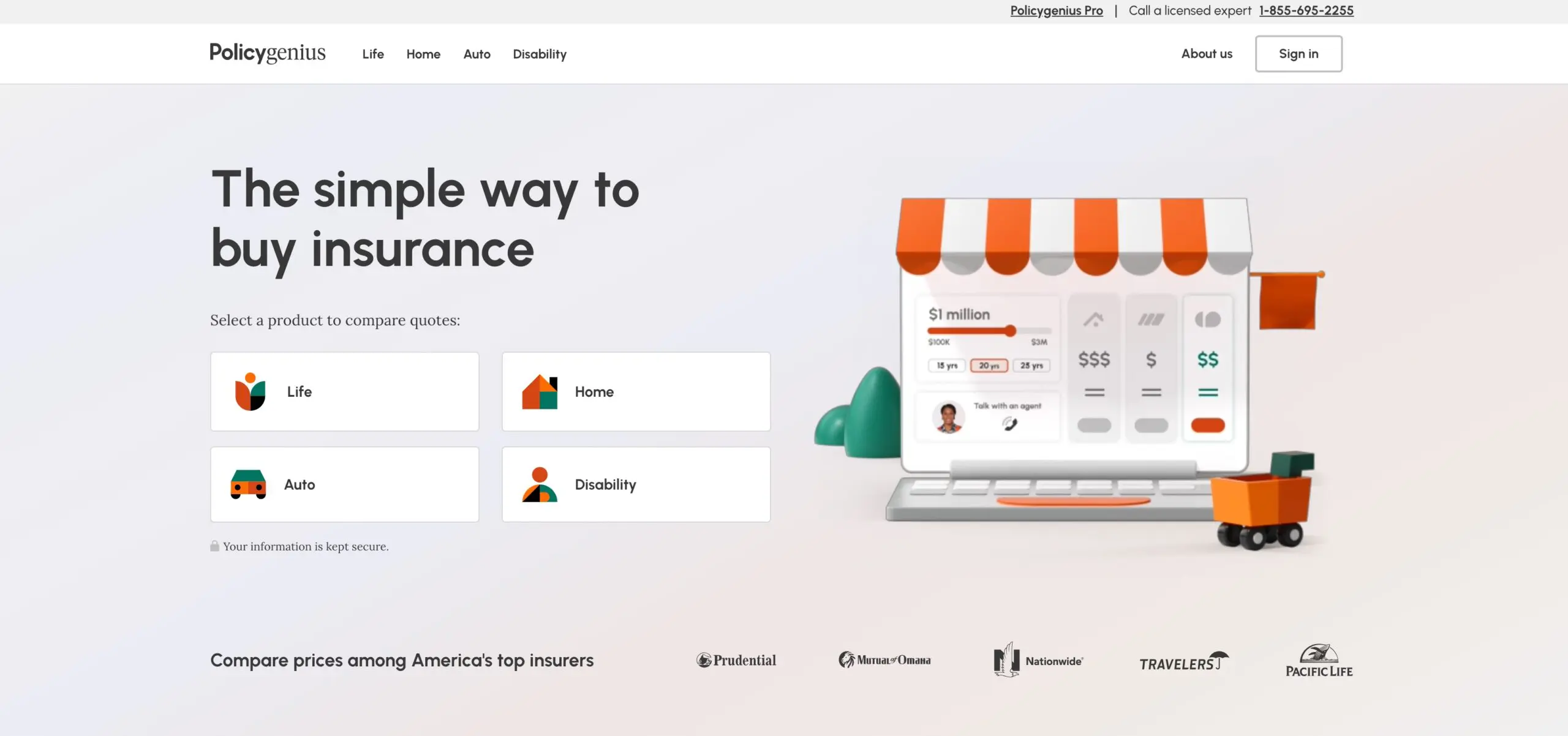
- Policygenius: This platform simplifies the process of comparing and purchasing insurance policies.
- User-Friendly Quote Comparison Tools: Policygenius provides intuitive tools that allow users to compare insurance quotes from multiple providers seamlessly. For instance, their home insurance comparison feature enables users to evaluate coverage options and rates efficiently, facilitating informed choices.
- Personalized Recommendations: The platform provides personalized recommendations based on individual needs and budgets.
- Transparent Presentation of Information: The website clearly outlines key aspects of insurance policies, including health classifications and differences between term and whole life insurance. This transparency helps demystify insurance products, building user trust and confidence in their services.
Cryptocurrency Mastered
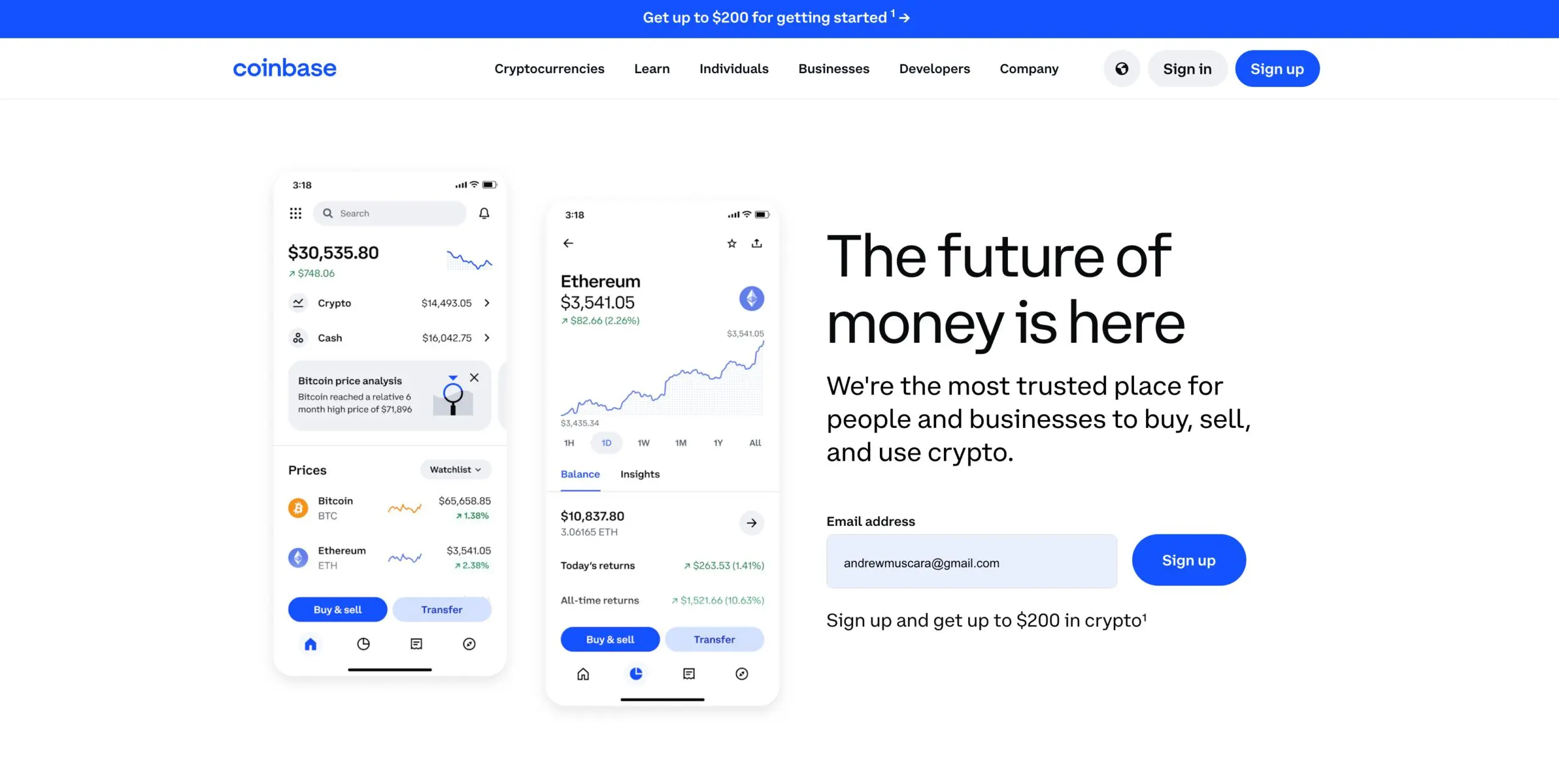
- Coinbase: This leading cryptocurrency exchange provides a user-friendly platform for buying, selling, and storing cryptocurrencies.
- User-Friendly Onboarding: Coinbase simplifies the onboarding process for new users, making it easy to get started with cryptocurrency.
- Custom Visual Identity: The website features a unique visual identity, including a custom typeface and color palette, balancing the traditional elements of the financial world with a modern, accessible aesthetic. This design approach enhances brand recognition and conveys trustworthiness.
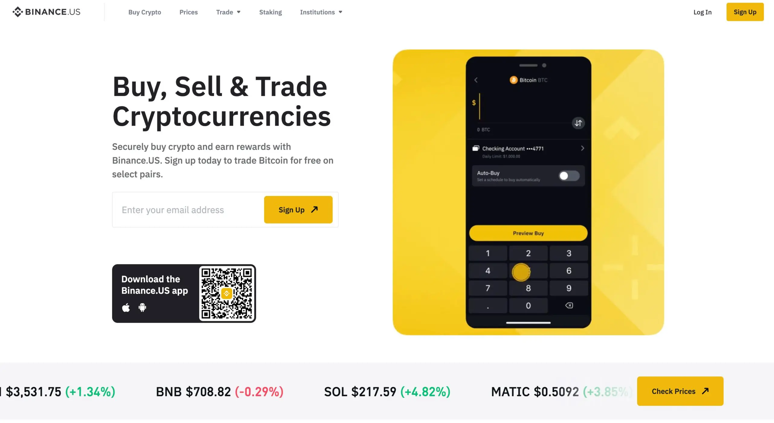
- Binance: This global cryptocurrency exchange offers a wide range of trading options and a highly liquid market.
- Facet Design System: Binance.US introduced the “Facet” design system, which includes a new library of icons, illustrations, and reusable components such as buttons and navigation elements. This system streamlines the creation of a consistent and cohesive product and brand experience, improving both design and engineering efficiency.
- Focus on Simplicity and Accessibility: The website is built with a focus on simplicity, ensuring that users can quickly perform tasks such as trading and checking market prices. The design avoids unnecessary complexity and keeps navigation straightforward.
Digital Banking Redefined
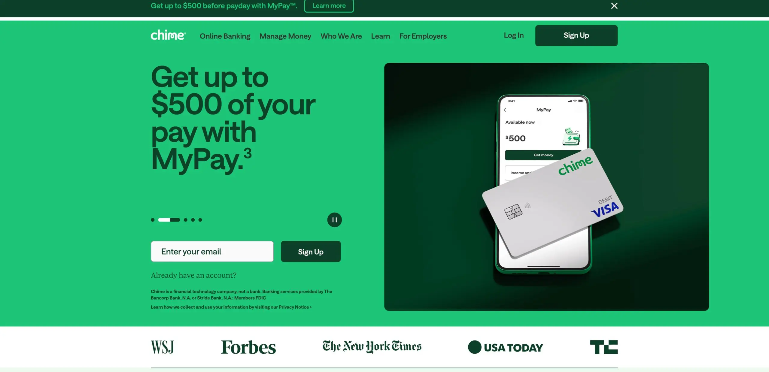
- Chime: This digital banking platform offers a range of fee-free services, including no overdraft fees and no monthly maintenance fees.
- Responsive and Mobile-First Design: As a digital-first bank, Chime’s website is built with mobile users in mind. Chime likely prioritizes responsive design, ensuring that the site performs well across all devices, particularly mobile. Since most of its users are likely to access the site via smartphones, the design process ensures that mobile optimization is at the forefront.
- Emphasis on Trust and Transparency: Chime has designed its website to foster trust and transparency, which is crucial in the financial industry. The web design includes elements like testimonials, customer reviews, and trust badges prominently on the homepage, which are designed to provide social proof and build confidence in the brand.
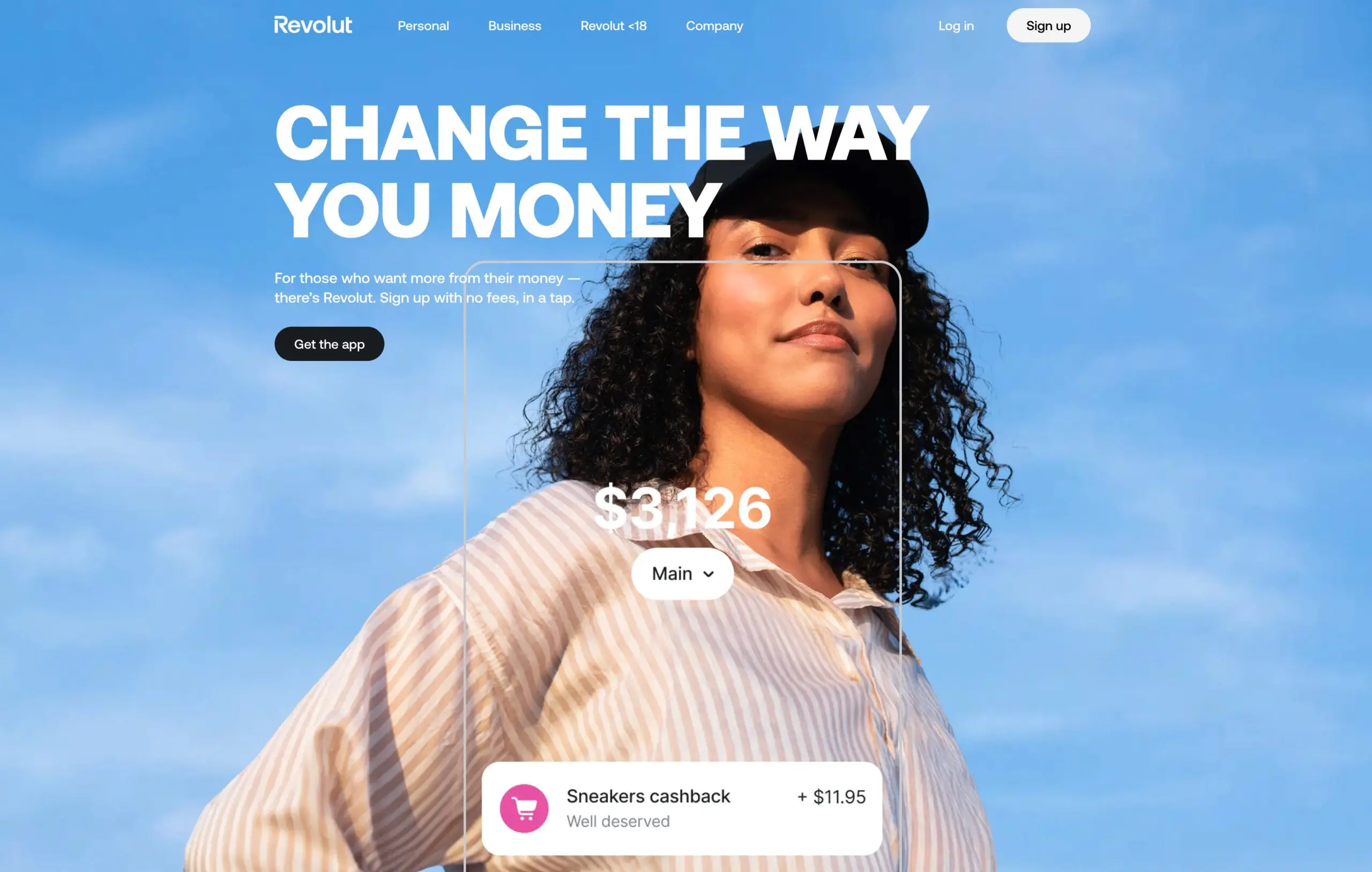
- Revolut: This fintech company offers a range of financial services, including multi-currency accounts, international spending, and cryptocurrency trading.
- Responsive and Adaptive Layouts: The website employs responsive design techniques, ensuring optimal display across various devices and screen sizes. This adaptability enhances user engagement and accessibility.
- Engaging and Interactive Features: Revolut integrates interactive components, including dynamic headers and animations, to provide a more immersive user experience. These features are thoughtfully designed to be intuitive and foster greater user interaction.
Conclusion
These 10 fintech websites demonstrate the power of effective fintech website design. By prioritizing user experience, leveraging technology, and building strong brands, these companies have successfully navigated the competitive fintech landscape.
At Motion Tactic, a leading B2B website design agency, we help fintech businesses build trust and drive growth with impactful websites and persuasive messaging.


